This time of year people think of new beginnings and making some life changes. The fact is, anything new that you add to your life needs to be worked into your daily schedule or it's not going to happen. How do you bring new tasks into your current schedule?
The best way is to see your goal tasks along with your daily schedule in your planner. This keeps your goals in front of you all the time, and lets you see where you can fit them into your days.
The first step is to review the past year to determine what you have achieved and what still needs work. Then write your annual goals, and break them down into your quarterly goals to get an overview of your plan for the year. (For more details on planning your annual and quarterly goals see this post.)
When you have your plan all set, you'll be able to break your goals down into actionable tasks. Here is where the plan turns to action and you'll start to notice a real difference in your effectiveness. By listing your daily goal tasks along with your schedule, you'll be able to see what you need to do and when you have time to do it. See more on how to incorporate your goal tasks into your weekly and daily schedule in this post.
The Plannerisms planners were specifically designed to help you work your goal tasks from the big overall picture, through your quarterly and monthly goals, to your weekly and daily tasks.
There are still some limited edition 2016 Plannerisms planners left to order, you can see ordering information here. But don't wait, because there will be no more made for 2016 so when they are gone they are gone for the year!
Saturday, December 26, 2015
Wednesday, December 16, 2015
2016 Plannerisms planners are ready to order!
Update: the 2016 Plannerisms planners are now sold out! Many thanks to everyone who bought a planner. There will be no more made for this year.
Look for the 2017 Plannerisms planners in early autumn here on Plannerisms.com!
Look for the 2017 Plannerisms planners in early autumn here on Plannerisms.com!
Tuesday, December 15, 2015
How to use the Review pages in your Plannerisms Planner
The Plannerisms planner incorporates methods that have been proven to help you set and reach your goals. One of these methods is regular reviews.
At the backs of the weekly booklets there are designated pages for your Half Year and Annual reviews.
These spaces are where you ask yourself questions like:
What went well in the past six/ twelve months?
What goals did I complete?
Which goals have I not completed?
What prevented me from completing these goals? (Roadblocks)
What can I change in order to break through these roadblocks?
Have any of my goals changed during the course of the past six/ twelve months?
Which goals became irrelevant?
After you have figured all of these out, you can decide what your goals should be for the next six/ twelve months.
Some people like to do monthly, and even mid-month reviews to stay on top of their progress. There is space for this in the Notes pages that are between every month's spread.
There are limited supplies of the Plannerisms planners, and when they are gone they are gone! Click here for ordering info.
How to use the Goals pages in your Plannerisms planner
I designed the Plannerisms planner to be an all-in-one place for your big-picture goals all the way down to the daily details. The Plannerisms planner has pages that can help you determine your goals for the year and then break them down into quarterly milestones, monthly goals and daily tasks.
There is a two-page spread where you can write your big goals for the year. If you like you can use one page for work goals and the other for personal, as shown below. This is where you dream big, and think of big things you want to accomplish before the year is over.
Next there is a two-page spread where you can break your annual goals down into quarterly goals. Think realistically about what you can accomplish in each three-month block. Take into account seasonal changes (how much will you be running in the winter months compared to summer, for example), slow times at work due to holidays, travel, and other major events.
After you have determined your quarterly goals you can break these down by months. The monthly pages in the Plannerisms planner give you an overview of each month. In the shaded area at the left you can write the month's focus, things to focus on in particular weeks, etc.
Between each monthly spread there is a two-page spread for Notes. This is where you can write your goal steps for the month, track your progress, and do your monthly evaluations/ reviews. (More on reviews in a separate post.) You can use this space any way you like.
Then you take your goal tasks directly to your schedule page. List your daily goals in the shaded area at the left so you can check them off every day with no re-writing. Write actions and tasks that help you work toward your goals directly into your day spaces so you can be sure to work them into your daily schedule and routines.
You can see more info on how to use the weekly pages here.
There are limited supplies of the Plannerisms planners, and when they are gone they are gone! Click here for ordering info.
How to use the Weekly pages in your Plannerisms planner
The Plannerisms planner's weekly pages are designed to help you incorporate your goal tasks into your daily schedule.
At the left there is a shaded column where you can write your daily goals and/ or intentions. This allows you to write them only once, and check them off each day.
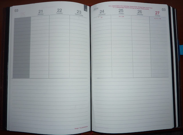
Under the day spaces there are areas to write your task lists, weekly reviews, mind maps, sketches, notes, and anything else you would like to put in this space. You can use it any way that suits you, and you can even use it differently week to week if you want.
The flexible format can be used any way you like. Here are a couple of suggestions:
Below is an example of how I use my weekly pages. You can see my goals in the shaded column. I circle appointments and make note of important events in red. I list things to bring along to an event above the entry.
Below the day spaces I write my categorized lists. I use a box for multi-step tasks. I fill in half the box to indicate when a task is in progress, and I fill the box in entirely when the item is completed.
You could also use the shaded column to divide your day spaces into different members of your family, work/ school/ home, etc.
There are loads of possible ways to use this flexible format.
There are limited stocks of the Plannerisms planners available for this year, and when they are gone they are gone! Click here for ordering info.
At the left there is a shaded column where you can write your daily goals and/ or intentions. This allows you to write them only once, and check them off each day.

Under the day spaces there are areas to write your task lists, weekly reviews, mind maps, sketches, notes, and anything else you would like to put in this space. You can use it any way that suits you, and you can even use it differently week to week if you want.
The flexible format can be used any way you like. Here are a couple of suggestions:
Below is an example of how I use my weekly pages. You can see my goals in the shaded column. I circle appointments and make note of important events in red. I list things to bring along to an event above the entry.
Below the day spaces I write my categorized lists. I use a box for multi-step tasks. I fill in half the box to indicate when a task is in progress, and I fill the box in entirely when the item is completed.
You could also use the shaded column to divide your day spaces into different members of your family, work/ school/ home, etc.
There are loads of possible ways to use this flexible format.
There are limited stocks of the Plannerisms planners available for this year, and when they are gone they are gone! Click here for ordering info.
Saturday, December 12, 2015
2016 Plannerisms Planners UPDATE
I have just received the notification that the 2016 Plannerisms planners are finished printing! Because we are getting them out so late in the year, THERE WERE ONLY 100 PRINTED. And when they are gone they are gone for the year, there will be no reprints for this year. So if you want a 2016 Plannerisms planner, you will have to order them as soon as they are available to order because when they are gone, they are gone for the year!
I will post the ordering link as soon as I have it, so keep checking here on the blog, Facebook and Twitter for the latest updates.
Meanwhile you can see this post for more info on prices and shipping, and you can see this post for photos and information about the planners themselves.
Make your list of who you want to get these planners for as gifts, because you might not get more than one chance to order! I will have ordering information up here the second it's ready.
Thank you for your interest everyone!
Update: the 2016 Plannerisms planners are now sold out! Many thanks to everyone who bought a planner! There will be no more printed for this year.
Look for the 2017 Plannerisms planners in early autumn here on Plannerisms.com!
Friday, December 11, 2015
2016 Plannerisms planners NEWS!
Hooray! Here is the latest news from my publisher:
Unfortunately we were not able to get these sold via Amazon this year after all, so all shipments will go from the publisher in Germany. We are working on a US distributor for next year.
The planners will finish printing in the next few days and will be available to order soon!
PLEASE NOTE: I created the original design of the Plannerisms planners, but I do not sell these planners myself. They are published, sold, and distributed by X17.de. If you have any questions about the ordering process, shipping, prices, customer service or anything else you will need to contact them directly at X17.de because I do not handle any of that myself. For more information on the planners themselves including size/ dimensions, formats etc see this post here. Disclosure: I do receive a percentage of sales.
Update January 15, 2016: The 2016 Plannerisms planners are sold out! Many thanks to everyone who bought a planner. There will be no more made for this year.
Look for the 2017 Plannerisms planners in early autumn here on Plannerisms.com!
Update: The 2016 Plannerisms planners are now ready to order! Info is here: http://www.plannerisms.com/p/how-to-buy-plannerisms-planners.html
The Plannerisms planners come as a package in three booklets: one booklet for month on two pages calendars, notes and goals pages; and two booklets for the weekly pages (6 months each). These booklets fit into a cover, you can see more info on the new Plannerisms planners system and how it works here.
Price: 19.90 € (Euros) which includes 19% German taxes (so the price for customers outside of Germany will be 16.72 € for USA and Canada)
The shipping cost to the USA, Canada and UK is 9.95 €.
You can see the exchange rate from Euros to your currency at an exchange website like XE.com or others.
Please note that for shipments out of the EU, additional customs duties could apply.
Please note, that the normal time for shipment is not less than 10 days to the US.Unfortunately we were not able to get these sold via Amazon this year after all, so all shipments will go from the publisher in Germany. We are working on a US distributor for next year.
The planners will finish printing in the next few days and will be available to order soon!
PLEASE NOTE: I created the original design of the Plannerisms planners, but I do not sell these planners myself. They are published, sold, and distributed by X17.de. If you have any questions about the ordering process, shipping, prices, customer service or anything else you will need to contact them directly at X17.de because I do not handle any of that myself. For more information on the planners themselves including size/ dimensions, formats etc see this post here. Disclosure: I do receive a percentage of sales.
Update January 15, 2016: The 2016 Plannerisms planners are sold out! Many thanks to everyone who bought a planner. There will be no more made for this year.
Look for the 2017 Plannerisms planners in early autumn here on Plannerisms.com!
Thursday, December 10, 2015
Week Dominator planner review
So I'm almost a year overdue for this review. Sorry guys! Better late than never, right?
You may remember my post on the Week Dominator planners back when they were doing their Kickstarter campaign (and if you don't, you can click here to see it).
The bad news is: the Week Dominator is currently sold out. (So now you are asking, why are you bothering to show us this review??) Because the good news is, the new updated version of the Week Dominator is available for pre-order and will be available soon! The insides are all the same so I will show you the layout.
Disclosure: I bought and paid for these planners myself for my own use. I happily helped fund their Kickstarter campaign.
The Week Dominator planner is the result of lots of research on planning and time management methods. The creators (the brilliance behind Neu Year) designed the planner to work with lots of different methods like time blocking, Pomodoro, goal setting, evalutions/ reviews, etc. The result will help you be more productive and allow you to dominate your time, not the other way around!
The Week Dominator planner is undated so you can start any time, leave it home when you're on vacation with no wasted pages, start it at the beginning of a big project, etc.
These are the covers I chose from the Kickstarter version of the planners. The new version will have different covers which they describe as rose-petal soft. Sounds nice!
The previous version of the Week Dominator planner had pockets, an elastic strap closure and a pen loop, which the new version will not have because it will be designed to fit into a classy looking folio that will have these features. The folio is currently still in development. I've seen sneak-peek photos of them and they look really nice!
Here is the letter from the creator giving you some insight into how the planner was developed:
Here are photos of the pages. Sorry for the poor photo quality. It's hard to get decent light this time of year at 57 degrees north! You can see their website for better images. This will give you an idea of the layout of the book. You can click on photos for a larger view.
There are these excellent year overview planners that show the months with the weeks not broken up, so you can have an overview of your entire year:
Next are the 80/20 pages: "80% of the results come from 20% of the work. Focus on the most productive 20%. Take 30 minutes at the end of each month to think about what's working (the 20%) and stop doing what's not working."
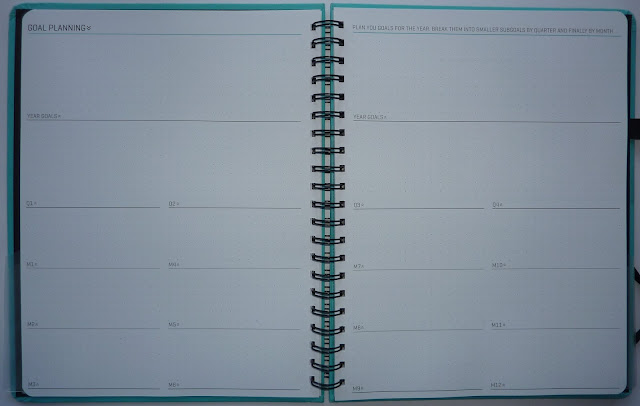
There are some very helpful tips and suggestions on ways to use the planner. The whole design is very flexible so you can use it any way that works for you.
The weekly pages are dotted so there's nothing to box you in. You can do time blocking on the timed daily columns. You can use extra space for notes and lists.
Between every weekly spread there is another two-page spread. The left page is for Idea Generation, more space for lists, sketches/ charts, notes, anything you need. The right page has a place to track your weekly goals, capture ideas and relationships, and evaluate your wins and lessons learned. All of these are proven methods for increasing productivity and effectiveness, so it's great to have them right there in your planner embedded in the weeks so you can't forget to do them weekly.
The original Week Dominator planners have letter size pages (8 1/2 by 11 inches) and have six months per book to keep them light enough to carry around. The new version has a soft lightweight cover which will make the books even more portable.
You can click here to pre-order the Week Dominator directly from Neu Year. I highly recommend these planners to anyone who wants a tool that will help them be more effective and productive, and that is easy and pleasant to use!
Note: I am not affiliated with Neu Year/ Week Dominator in any way. I do not sell these products and I do not receive any commission from their sales. If you have any questions about ordering, customer service, products, or anything else, you will need to contact them directly at www.Neuyear.net.
You may remember my post on the Week Dominator planners back when they were doing their Kickstarter campaign (and if you don't, you can click here to see it).
The bad news is: the Week Dominator is currently sold out. (So now you are asking, why are you bothering to show us this review??) Because the good news is, the new updated version of the Week Dominator is available for pre-order and will be available soon! The insides are all the same so I will show you the layout.
Disclosure: I bought and paid for these planners myself for my own use. I happily helped fund their Kickstarter campaign.
The Week Dominator planner is the result of lots of research on planning and time management methods. The creators (the brilliance behind Neu Year) designed the planner to work with lots of different methods like time blocking, Pomodoro, goal setting, evalutions/ reviews, etc. The result will help you be more productive and allow you to dominate your time, not the other way around!
The Week Dominator planner is undated so you can start any time, leave it home when you're on vacation with no wasted pages, start it at the beginning of a big project, etc.
These are the covers I chose from the Kickstarter version of the planners. The new version will have different covers which they describe as rose-petal soft. Sounds nice!
The previous version of the Week Dominator planner had pockets, an elastic strap closure and a pen loop, which the new version will not have because it will be designed to fit into a classy looking folio that will have these features. The folio is currently still in development. I've seen sneak-peek photos of them and they look really nice!
Here is the letter from the creator giving you some insight into how the planner was developed:
Here are photos of the pages. Sorry for the poor photo quality. It's hard to get decent light this time of year at 57 degrees north! You can see their website for better images. This will give you an idea of the layout of the book. You can click on photos for a larger view.
There are these excellent year overview planners that show the months with the weeks not broken up, so you can have an overview of your entire year:
Next are the 80/20 pages: "80% of the results come from 20% of the work. Focus on the most productive 20%. Take 30 minutes at the end of each month to think about what's working (the 20%) and stop doing what's not working."
Next are goal setting pages to help you break down your annual goals into quarterly and monthly subgoals.

There are some very helpful tips and suggestions on ways to use the planner. The whole design is very flexible so you can use it any way that works for you.
The weekly pages are dotted so there's nothing to box you in. You can do time blocking on the timed daily columns. You can use extra space for notes and lists.
Between every weekly spread there is another two-page spread. The left page is for Idea Generation, more space for lists, sketches/ charts, notes, anything you need. The right page has a place to track your weekly goals, capture ideas and relationships, and evaluate your wins and lessons learned. All of these are proven methods for increasing productivity and effectiveness, so it's great to have them right there in your planner embedded in the weeks so you can't forget to do them weekly.
The original Week Dominator planners have letter size pages (8 1/2 by 11 inches) and have six months per book to keep them light enough to carry around. The new version has a soft lightweight cover which will make the books even more portable.
You can click here to pre-order the Week Dominator directly from Neu Year. I highly recommend these planners to anyone who wants a tool that will help them be more effective and productive, and that is easy and pleasant to use!
Note: I am not affiliated with Neu Year/ Week Dominator in any way. I do not sell these products and I do not receive any commission from their sales. If you have any questions about ordering, customer service, products, or anything else, you will need to contact them directly at www.Neuyear.net.
Wednesday, December 9, 2015
Moleskine Spring 2016 catalog with 2017 planners!
The Spring 2016 Moleskine catalog is out with their 2017 planners!
http://www.chroniclebooks.com/landing-pages/catalogs/moleskine/
I'll make comments as I go through it. So exciting!
Disclaimer: I am not affiliated with Moleskine in any way and I do not receive any commissions on their sales. I do not have any contacts or know anyone at Moleskine so if you have any questions about their products or how to purchase them, you will need to contact Moleskine directly.
Hard cover notebooks have new colors: coral orange (very interesting!), sapphire blue, citron yellow and willow green in addition to the usual black and red.
Soft cover notebooks have added grid pages to the lineup, so they will be available with blank, lined, dotted or grid pages.
Limited edition notebooks: Toy Story.
Ok here we go: planners!
18 month planners: looks like they no longer have tabbed address booklets, which is too bad because I actually use those. Instead they come with stickers.
18 month weekly notebook planners with hard covers in Pocket and Large sizes have new colors: Steel Blue, Coral Orange, Malachite Green and Grape Violet in addition to the usual Black.
Soft cover weekly notebooks have black or red covers.
The new colors also apply to the hard cover 12 month daily and weekly planners. Soft cover 12 month planners come in black or red.
The Professional weekly vertical planner in A4 size is back after being absent for a few years.
Limited Edition planners: Batman. Let Petit Prince, Peanuts. No Star Wars???
Those are the major changes, which aren't all that major really. The new colors look nice.
UPDATE Feb 27, 2016: I have just received my 2016-2017 18 month Moleskine weekly notebook and I am THRILLED to report they have gone back to printing holidays on the day spaces as they did in years past! They must have received floods of complaints when they took away the holidays and made people look them up on their website and write them in themselves. (I know I was severely annoyed by it). The name of the holiday is not printed, just the country abbreviation on the day. For example, on July 4 "US" is printed for Independence Day. Also on Easter Sunday, the countries that celebrate it are printed on the day. This is great for those of us who don't like to look up and write holidays in ourselves! (Especially those of us who tend to mistakenly write things in on the wrong day!) Thank you Moleskine for bringing back the holidays!
Also, the 2016-2017 weekly notebook still has the monthly pages as grid calendars for July 2016-December 2017, not vertical monthly columns as in years past. Personally I prefer the month grids but it does mean there aren't pages for planning the future year. I'm going to get around this by using 4 of the notes pages in the back of the book as a forward planner for 2018 with 3 months per page. There is a 2018 reference calendar in the book so I can look up dates when I need to.
I can confirm the hardcover weekly notebooks no longer come with an address booklet, which is my only disappointment. Instead, in the back pocket are 3 sheets of stickers: Alphabet letters, and a seemingly random assortment of weather symbols, emoticons, icons and symbols.
I'm very pleased to have the holidays printed AND month grid calendars! Thank you Moleskine!
Labels:
Moleskine
Tuesday, December 8, 2015
The Dream Organiser
The Dream Organiser is a brand-new planner that is designed to incorporate all aspects of your life into one book. The creator, Gillie, told me how it came about:
Disclaimer: I received this planner as a free sample to review.
The Dream Organiser has 299 (numbered) A4 size pages that are color-coded in sections, making it easy to find what you are looking for. Below is the table of contents and the introduction by Gillie:
I'm only going to show you a tiny bit of what you get in this planner, because I don't want to give away any secrets and this planner has so much!
Goal setting is a major theme throughout the book.
There are loads of tips on how to set goals, and specialized pages for your Wheel Of Life, reviewing the previous year, capturing your dreams and getting them down on paper, how to focus on your dreams, and more. I'm not showing these pages on purpose, because they are special and I don't want to give them away.
The next section is on Self Care, which is so rare to find in a planner. Usually planners are all about things you have to do. It's nice to have space in your planner to focus on you and what you need.
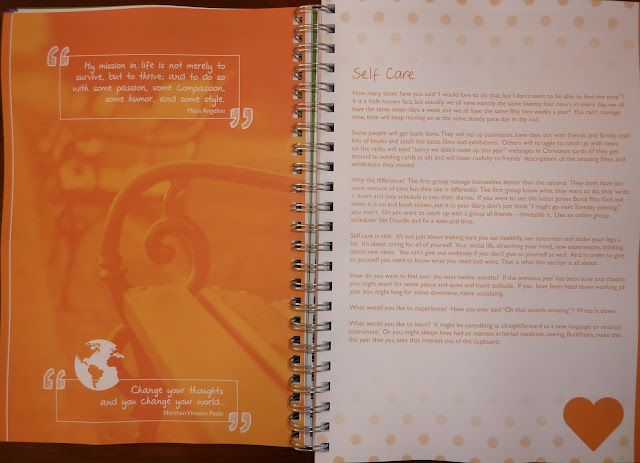
Next is a section for planning projects. There are pages to help you break down the plan, determine your resources available, the aim and scope of the project, and more. Again I'm not showing the pages on purpose! These pages are all very useful to get you to focus.
Next are the diary/ planner pages, which are undated so you can start any time. There are 12 months of weekly pages with all seven days as vertical columns, and lots of space on the weekly spread for your goals, tasks and dreams. Monthly grid calendars and monthly goals pages are incorporated within the weeks to keep you on track. Every month has a new inspirational quote.
The next section has pages for meeting notes. These pages are structured so you can automatically organize your notes as the meeting goes on, making it easy to see decisions made and follow-up actions.
At the back of the book there are several blank, lined and grid pages for sketches, notes and charts.
The result is a very substantial book! The page size is A4 so you have lots of space to write everything. 299 pages makes it more than 2 cm thick. There is a lot of content in there!
The Dream Organiser is available to purchase from the following websites: Amazon UK, Ebay, and Etsy. Please note I am not affiliated and receive no commission from sales.
Be sure to join their Facebook group too!
Many thanks to Gillie for giving me the opportunity to review this amazing new planner!
"What I was looking for was something that enabled me to have all my dream and goal setting, diary, planner, reflections and plans all in one place. Thus The Dream Organiser was born. I have nicknamed it the life coach in your handbag."
Disclaimer: I received this planner as a free sample to review.
The Dream Organiser has 299 (numbered) A4 size pages that are color-coded in sections, making it easy to find what you are looking for. Below is the table of contents and the introduction by Gillie:
I'm only going to show you a tiny bit of what you get in this planner, because I don't want to give away any secrets and this planner has so much!
Goal setting is a major theme throughout the book.
There are loads of tips on how to set goals, and specialized pages for your Wheel Of Life, reviewing the previous year, capturing your dreams and getting them down on paper, how to focus on your dreams, and more. I'm not showing these pages on purpose, because they are special and I don't want to give them away.
The next section is on Self Care, which is so rare to find in a planner. Usually planners are all about things you have to do. It's nice to have space in your planner to focus on you and what you need.

Next is a section for planning projects. There are pages to help you break down the plan, determine your resources available, the aim and scope of the project, and more. Again I'm not showing the pages on purpose! These pages are all very useful to get you to focus.
Next are the diary/ planner pages, which are undated so you can start any time. There are 12 months of weekly pages with all seven days as vertical columns, and lots of space on the weekly spread for your goals, tasks and dreams. Monthly grid calendars and monthly goals pages are incorporated within the weeks to keep you on track. Every month has a new inspirational quote.
The next section has pages for meeting notes. These pages are structured so you can automatically organize your notes as the meeting goes on, making it easy to see decisions made and follow-up actions.
At the back of the book there are several blank, lined and grid pages for sketches, notes and charts.
The result is a very substantial book! The page size is A4 so you have lots of space to write everything. 299 pages makes it more than 2 cm thick. There is a lot of content in there!
The Dream Organiser is available to purchase from the following websites: Amazon UK, Ebay, and Etsy. Please note I am not affiliated and receive no commission from sales.
Be sure to join their Facebook group too!
Many thanks to Gillie for giving me the opportunity to review this amazing new planner!
Saturday, December 5, 2015
Agendio planner review
My Agendio planner arrived yesterday! You may have seen my introduction post on the Agendio planners (which you can see here if you haven't already). Agendio.com is an amazing new online planner creator where you choose every aspect of your planner: the layout, the size, font, colors, add-ons and more. And you add in your own labels for lists, select your holidays, add your personalized events, and much more. These details are all saved so you don't have to add them again when you make your next planner!
The planner customizer takes a few minutes to get the hang of, so take a look at all the possibilities and play around with it. It's very addictive! Look at all the features (which you can see the overview of here).
I'll walk you through the planner I created so you can see some of the options. Remember this is just one, there are loads to choose from.
Disclosure: I received a discount code so I could create and receive this planner as a free sample to review.
I was too excited to take a picture before I ripped the package open, but I should have because the planner was beautifully wrapped in tissue paper with a logo sticker. Very elegant.
I went for their largest planner (8 1/2 by 11 inches), in the turquoise blue cover. I chose the color-matched elastic closure strap. You can also choose black, or none.
Before I go any further I want to make a note of the paper sizes. Agendio is located in North America, so they use standard North American paper sizes (letter size is 8 1/2 by 11 inches). They do not use European sizes (A4, A5 etc.). This of course makes sense because 1) their North American customers want the paper sizes they use and are accustomed to, and 2) it makes much more financial sense to use the local paper sizes than to import European sizes. So if you are not in North America, be sure to look at the page dimensions so you know what you are getting.
Let's continue! I want to apologize for the quality of my photos. It's very hard to get good light here this time of year, so the photos are a bit dark and the pages don't look nearly as nice as they do in real life. So as you look at these, please keep in mind these photos don't do the planner justice! You can click on images for a larger view.
The first page has the Agendio logo, and lists the Model number which is handy if you want to reorder and/ or tell people which Model you got. This one is Model number 32162. There is also space at the bottom of the page to write your contact info in case of loss.
The next page is a feature I love, and actually use: month overviews for the 12 months in your planner. My planner goes from December 2015-November 2016 so those are the months shown on this page. Very handy. Opposite is a lined page for notes, goals, frequently used numbers, whatever you like.
My planner is a monthly + weekly, and I chose to have my months at the beginning of the book. You could also choose to have the months at the back of the book, or embedded within the weeks. I love the big open day squares. You can also choose to have them lined, and you can select which line spacing you prefer.
I customized every aspect of the pages: which holidays to add, what I wanted the list area at the right to look like and what label I wanted for it, etc.
There are monthly calendars for the 12 months of your planner plus the next month, so my planner has month calendars for December 2015 through December 2016, which is very nice for forward planning. This means for example if you created your planner for the school year August through July, your monthly calendars would go August through the following August, so you can plan through the whole summer. Very convenient!
Below is my weekly layout. This one has the Span feature (more on that in a minute), two divisible areas at the right, and space under the daily columns for Activities.
Here you can see a closer look. I chose the Fondamento font, but there are loads of other fonts to choose from. I also chose turquoise print but you can choose from lots of different colors. You can see the Span feature, which allows you to write tasks or events over multiple days. Take a look at the holidays listed in Monday below, I want to tell you something about them:
One of the first questions the customizer asks is which country you will be using your planner in. Here's why: in Monday above there is Spring Bank Holiday, which is a UK holiday, and Memorial Day (US). Since I live in the UK, I set that as my location. That causes the UK holidays to appear as above, and holidays of other countries have their country notation so I know which country they are for.
Here you can see a better view of my lists at the right. I chose how may lines I wanted for each area, if I wanted them solid or dotted, square or round check boxes, and of course the labels.
Below the day column is a small area that I labeled Due Today. On the first Saturday of every month I have a reminder to check the batteries in my smoke and CO2 detectors. I also have blog post topics in the days as reminders. When I originally created a planner, they did not have these small spaces available, only larger ones. I requested this area to be smaller so the day column could be longer with more hours, and voila! They tweaked it for me. Keep in mind, the smaller the area below the days, the fewer Activities it will hold. This one only holds two, which is plenty for me. There are other formats with larger spaces for more Activities.
After all the weekly pages there are forward planning pages for the following 12 months, which is great so you can plug in future dates.
I chose to add the double-sided pocket to put papers into. This is a great place to put bills, receipts, birthday or wedding invitations, etc.
I also chose perforated tear-off corners, and their logo placemarkers.
You can choose to have your planner start any month, up to 6 months in advance. You can have your weeks start with any day, which is great for people who work shift or non-traditional work weeks.
The quality is fantastic: the paper is white, smooth and 90 gsm. The cover is soft to the touch but durable. Despite being full letter size, the planner is remarkably light: I weighed mine at 652 g.
I loved adding in all my own holidays and events like birthdays and anniversaries. Normally when I buy a planner I have to write in all kinds of things: holidays if they're not already in there, moon phases, and at the very minimum birthdays and anniversaries. With the customizer, these were all printed in, and are saved for the next time I make a planner!
You can make multiple planners, with different holidays and events too. So for example if you make a planner for someone else, you can put their holidays and important days in. Or if you make a planner specifically for work, you can have only work-related events and no personal ones.
I am very pleased with the result of my planner. Agendio.com is great for those of us who want to be able to customize our planner, a little or a lot.
They now also have refill pages for Filofax, Franklin Covey and Day Timer, so be sure to check those out too!
Labels:
Agendio
Tuesday, December 1, 2015
Thank you for your patience!
Hi everyone, I'm waiting to hear from my publisher all the details on pricing and when the Plannerisms planners will be ready to ship. As soon as I have this information I will post it here on Plannerisms, so keep an eye out. Not long now!
Thanks again so much to everyone for your interest!
Laurie
Thanks again so much to everyone for your interest!
Laurie
Saturday, November 21, 2015
Agendio customizable planners
Oh my gosh, you guys. Get ready for this.
So you've probably already seen reviews for Agendio.com on The Well-Appointed Desk and Homemaker's Daily (and if you haven't yet, you should. Go click through the links to check them out. I'll wait. Are you back? Ok good.).
I have to admit I'm annoyed that other bloggers got their posts out before I did on this new planner brand. I don't like to be scooped! ;) But I wanted to take my time to really get to know their system before I posted.
Agendio.com is a new planners website where you build every aspect of your planner. You choose the starting month, size, the layout, fonts and colors. But there's WAY more to it than that. Scroll down on their home page to see the overview of their features, then go to Features to see more details. Are you back? Okay good. I'll talk you through the options.
There are lots and lots of templates to choose from. Then within those templates there are lots of options. For example you can choose a weekly format with days as columns, grid, or rows. Would you like monthly pages with that? Cool. Which layout of monthly pages would you like? And would you like your months at the front of the book, at the back, or embedded between the weeks?
What colors would you like? How would you like your days to appear? You can choose it all. Edited to add: If you don't see the exact layout you want, let them know and they can probably create it for you! In the template I chose, I wanted more timed space and less space below the daily column. So they created that for me! They really want to make the perfect planner for you, so let them know what you want.
I chose a vertical weekly layout. In this layout you can choose if you want your days timed, or not. If timed, you can choose what time to start/ end, and if they are timed to the hour or half hour. You can choose which day to start your week. You work shifts and your week starts on Wednesday? No problem!
Then within your weeks there are more things to customize. There are areas called Divisibles where you can create your own labels for whatever: categorized lists, areas to do menu planning, a spot for each person in your family, weekly goals, etc. In the planner I made, I created spaces for all my different work projects, plus personal tasks. Different layouts have different amounts of space for these divisibles, so you can choose a little or a lot of space for your lists. You can have it as one big open space, or divided. It's your choice!
There are other features called Pagelets, which are in various locations around the page. You can decide if you want a month view on the weekly pages, a space for weekly goals, etc. One Pagelet feature I found especially intriguing is the Span which I haven't seen in a weekly planner before. It is on some of the vertical column weekly formats (but not all of them, so look carefully). It allows you to draw across the days so you can see how many projects you are working on at once. Here is their explanation of Spans:
I could go on and on about how to customize the appearance of your planner, but it's kind of like the Matrix: you have to see it for yourself. Start on their home page and scroll all the way down to the bottom so you can see the overview of the features. Then take some time to explore and try different sizes and formats. Be sure to click on every area on the planner pages, because every part is customizable!
Then there is a whole 'nother layer of customization: you can choose holidays, recurring events, and special occasions.
There are national holidays for just about every country in the world, so you can choose holidays for your country, countries where your friends and family live, places you'll be traveling this year, or your dream destinations.
There are also regional and state-specific holidays and observances you can add too.
There are religious holidays for just about every religion too, so you can add your religion's holidays, those of other religions in your area, or none at all.
You can enter recurring events like birthdays and anniversaries. You can enter things that happen once a year, once a month (like checking smoke alarm batteries), every week (like the staff meeting on Mondays or to put out the trash every Wednesday), things that happen on Monday, Wednesday and Friday each week, or things that happen daily (take meds, exercise).
You can even choose when to start and stop events if they don't happen all year. So for example if you or your family have activities only part of the year (like sports, prep for taxes, family vacations, etc) you can enter those for only the duration when they happen.
All of your events and holidays are stored for the next time you make a planner! So every year, your planner can automatically have all your important dates printed into it. Or you can adjust and change them for your new planner. As you wish!
Again I recommend really taking your time to explore every aspect of these planners because they have so much to offer!
There are also accessories to choose: which color elastic closure strap (color-matched, or black), tear-off corners (or not), pockets, extra notes pages, etc. For you paper geeks out there: the paper is white and 90 gsm.
For all the customizable options you get in these planners, the prices are remarkably reasonable. I really went to town on mine with the largest size and most features and accessories, and it was still only just over 50 bucks. Which is amazing compared to some decorative planners out there that run into the $60-70 (or more) dollar range.
Agendio.com is based in North America. It does ship internationally, but not to all countries. Go under Shipping on their FAQ page to see the list of countries they currently ship to.
Be sure to check out their Promotions page for sales! Right now until November 30, 2015 you can get 25% off the cost of any planner! Also you can get a code to create a customized planner PDF. Click here for promotions details.
My planner is being processed now and will ship to the UK, so it will take a couple of weeks to get here. When it arrives I will do a full review and show you all the features I chose.
For those of you who use a Filofax, Franklin Covey, Day-Timer or other ring binder planner, get ready! On Nov 28th they will have available planner refill pages for these! You can sign up for an email notification when they are ready. I will explore those and do a post about them on Philofaxy.
All images copyright Agendio.com and used with permission.
So you've probably already seen reviews for Agendio.com on The Well-Appointed Desk and Homemaker's Daily (and if you haven't yet, you should. Go click through the links to check them out. I'll wait. Are you back? Ok good.).
I have to admit I'm annoyed that other bloggers got their posts out before I did on this new planner brand. I don't like to be scooped! ;) But I wanted to take my time to really get to know their system before I posted.
Agendio.com is a new planners website where you build every aspect of your planner. You choose the starting month, size, the layout, fonts and colors. But there's WAY more to it than that. Scroll down on their home page to see the overview of their features, then go to Features to see more details. Are you back? Okay good. I'll talk you through the options.
There are lots and lots of templates to choose from. Then within those templates there are lots of options. For example you can choose a weekly format with days as columns, grid, or rows. Would you like monthly pages with that? Cool. Which layout of monthly pages would you like? And would you like your months at the front of the book, at the back, or embedded between the weeks?
What colors would you like? How would you like your days to appear? You can choose it all. Edited to add: If you don't see the exact layout you want, let them know and they can probably create it for you! In the template I chose, I wanted more timed space and less space below the daily column. So they created that for me! They really want to make the perfect planner for you, so let them know what you want.
I chose a vertical weekly layout. In this layout you can choose if you want your days timed, or not. If timed, you can choose what time to start/ end, and if they are timed to the hour or half hour. You can choose which day to start your week. You work shifts and your week starts on Wednesday? No problem!
Then within your weeks there are more things to customize. There are areas called Divisibles where you can create your own labels for whatever: categorized lists, areas to do menu planning, a spot for each person in your family, weekly goals, etc. In the planner I made, I created spaces for all my different work projects, plus personal tasks. Different layouts have different amounts of space for these divisibles, so you can choose a little or a lot of space for your lists. You can have it as one big open space, or divided. It's your choice!
There are other features called Pagelets, which are in various locations around the page. You can decide if you want a month view on the weekly pages, a space for weekly goals, etc. One Pagelet feature I found especially intriguing is the Span which I haven't seen in a weekly planner before. It is on some of the vertical column weekly formats (but not all of them, so look carefully). It allows you to draw across the days so you can see how many projects you are working on at once. Here is their explanation of Spans:
"Span pagelets allow you to plan tasks across many days. See in one view how many tasks require your attention at the same time."
I could go on and on about how to customize the appearance of your planner, but it's kind of like the Matrix: you have to see it for yourself. Start on their home page and scroll all the way down to the bottom so you can see the overview of the features. Then take some time to explore and try different sizes and formats. Be sure to click on every area on the planner pages, because every part is customizable!
Then there is a whole 'nother layer of customization: you can choose holidays, recurring events, and special occasions.
There are national holidays for just about every country in the world, so you can choose holidays for your country, countries where your friends and family live, places you'll be traveling this year, or your dream destinations.
There are also regional and state-specific holidays and observances you can add too.
There are religious holidays for just about every religion too, so you can add your religion's holidays, those of other religions in your area, or none at all.
You can enter recurring events like birthdays and anniversaries. You can enter things that happen once a year, once a month (like checking smoke alarm batteries), every week (like the staff meeting on Mondays or to put out the trash every Wednesday), things that happen on Monday, Wednesday and Friday each week, or things that happen daily (take meds, exercise).
You can even choose when to start and stop events if they don't happen all year. So for example if you or your family have activities only part of the year (like sports, prep for taxes, family vacations, etc) you can enter those for only the duration when they happen.
All of your events and holidays are stored for the next time you make a planner! So every year, your planner can automatically have all your important dates printed into it. Or you can adjust and change them for your new planner. As you wish!
Again I recommend really taking your time to explore every aspect of these planners because they have so much to offer!
There are also accessories to choose: which color elastic closure strap (color-matched, or black), tear-off corners (or not), pockets, extra notes pages, etc. For you paper geeks out there: the paper is white and 90 gsm.
For all the customizable options you get in these planners, the prices are remarkably reasonable. I really went to town on mine with the largest size and most features and accessories, and it was still only just over 50 bucks. Which is amazing compared to some decorative planners out there that run into the $60-70 (or more) dollar range.
Agendio.com is based in North America. It does ship internationally, but not to all countries. Go under Shipping on their FAQ page to see the list of countries they currently ship to.
Be sure to check out their Promotions page for sales! Right now until November 30, 2015 you can get 25% off the cost of any planner! Also you can get a code to create a customized planner PDF. Click here for promotions details.
My planner is being processed now and will ship to the UK, so it will take a couple of weeks to get here. When it arrives I will do a full review and show you all the features I chose.
For those of you who use a Filofax, Franklin Covey, Day-Timer or other ring binder planner, get ready! On Nov 28th they will have available planner refill pages for these! You can sign up for an email notification when they are ready. I will explore those and do a post about them on Philofaxy.
All images copyright Agendio.com and used with permission.
Labels:
Agendio,
custom,
customizable
Wednesday, November 18, 2015
Plannerisms winners, and feedback
Huge thanks to everyone to participated in the giveaway! We had a great turnout, and I'm really happy so many people are interested.
I won't name the three winners for privacy reasons, but they have already been sent their email notifications. Congratulations to the winners!
I've had loads of feedback on the photos of the planner pages and the covers. Thanks very much to everyone for your input. I've had lots of great suggestions, some are possible and some are not. I've had lots of conflicting input too: some people want a feature one way, other people want it the opposite way.
That is why I've tried to make the Plannerisms planners as much of a blank slate as possible, with a flexible structure that doesn't box you in. One example is the untimed columns. Most people have said they like the untimed columns, but some people have requested them to be timed. But starting with what time? And ending when? Timed to the hour, or half hour? Some people will want the times earlier, some later. There's no way to please everyone. So the day columns will be untimed, so you can write your times in if you want.
I've also had some negativity, which is hard to take. This is my fourth year putting the Plannerisms planners out into the world. Every year I feel like I really put myself out there. Every year there are difficulties. And every year I feel like it's a miracle I've been able to get these published at all. I realize that I can't make everyone happy all the time. But I think, if given the chance, these planners will work really well for most people. They will help you set and track your goals, and incorporate them into your daily actions. That is the purpose of the Plannerisms planners, and I hope people like them.
Some people have requested information on how to use the planners to be put into the actual planners themselves. There would be too much content taking up too much space in the book, so it will all be here on Plannerisms.com. The website is listed on the inside front page of the planners so you can access information on how to use the goals pages, how to do half-year and annual reviews, different ways to use the weekly pages, etc. I'll have top tabs here on the blog so all the how-to-use info will be easy to find.
One change we are definitely making is to lighten the shaded column. Everyone agreed on that!
The main topic of debate right now is whether to keep the daily columns separated only by a small gap as they are now, or to add faint lines between the daily columns. I drew lines in pencil on a weekly page to let you see what that would look like. I'm running a poll at the top of the sidebar, please let me know your preference and we will go with the majority vote. My tendency is to leave it open, and people who want lines can easily draw them in. Let me know which you prefer!
Thanks again everyone for all of your support! I really, truly appreciate it.
Laurie
I won't name the three winners for privacy reasons, but they have already been sent their email notifications. Congratulations to the winners!
I've had loads of feedback on the photos of the planner pages and the covers. Thanks very much to everyone for your input. I've had lots of great suggestions, some are possible and some are not. I've had lots of conflicting input too: some people want a feature one way, other people want it the opposite way.
That is why I've tried to make the Plannerisms planners as much of a blank slate as possible, with a flexible structure that doesn't box you in. One example is the untimed columns. Most people have said they like the untimed columns, but some people have requested them to be timed. But starting with what time? And ending when? Timed to the hour, or half hour? Some people will want the times earlier, some later. There's no way to please everyone. So the day columns will be untimed, so you can write your times in if you want.
I've also had some negativity, which is hard to take. This is my fourth year putting the Plannerisms planners out into the world. Every year I feel like I really put myself out there. Every year there are difficulties. And every year I feel like it's a miracle I've been able to get these published at all. I realize that I can't make everyone happy all the time. But I think, if given the chance, these planners will work really well for most people. They will help you set and track your goals, and incorporate them into your daily actions. That is the purpose of the Plannerisms planners, and I hope people like them.
Some people have requested information on how to use the planners to be put into the actual planners themselves. There would be too much content taking up too much space in the book, so it will all be here on Plannerisms.com. The website is listed on the inside front page of the planners so you can access information on how to use the goals pages, how to do half-year and annual reviews, different ways to use the weekly pages, etc. I'll have top tabs here on the blog so all the how-to-use info will be easy to find.
One change we are definitely making is to lighten the shaded column. Everyone agreed on that!
The main topic of debate right now is whether to keep the daily columns separated only by a small gap as they are now, or to add faint lines between the daily columns. I drew lines in pencil on a weekly page to let you see what that would look like. I'm running a poll at the top of the sidebar, please let me know your preference and we will go with the majority vote. My tendency is to leave it open, and people who want lines can easily draw them in. Let me know which you prefer!
 |
| The columns as they are now: no vertical lines |
 |
| The columns as they could be: with vertical lines |
Thanks again everyone for all of your support! I really, truly appreciate it.
Laurie
Tuesday, November 17, 2015
2016 Plannerisms planners first look!
Here is the first look at the 2016 Plannerisms planners!
These are the first-run samples. The final products are now shipping! Click here for ordering information. Only 100 were printed, and when they are gone they are gone! So if you want one, act fast!
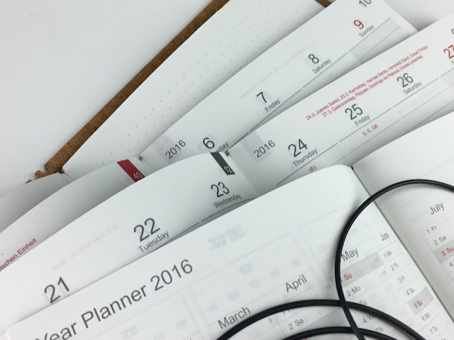
The 2016 Plannerisms planners are published by X17, a German company that makes planner and notes booklets that fit into gorgeous covers. Their products are top quality, and I am extremely happy to be working with them on the new Plannerisms planners!
The 2016 Plannerisms planners will be available to ship worldwide. All stock will be available to ship from Germany to locations worldwide. I don't have the shipping price info yet but I will let you know when I do.
Just like in years past the 2016 Plannerisms planners will have month on two page grid calendars with notes pages between each month; weekly pages with space to write lists and goals; pages to write Annual, Quarterly and Monthly goals, and more. The weekly pages have holidays printed for the US and European countries, and moon phases
The 2016 Plannerisms planners are in three booklets that fit into a cover, held by elastics. The Plannerisms set will also come with a notes booklet with dotted, numbered pages. This allows you the flexibility to add notes, sketches, contacts or anything you need, and when that booklet fills up you can replace it. Each cover holds four booklets, allowing you to keep your entire year of monthly and weekly pages plus notes together in your book. Here is a video that shows how the booklets go in the cover.
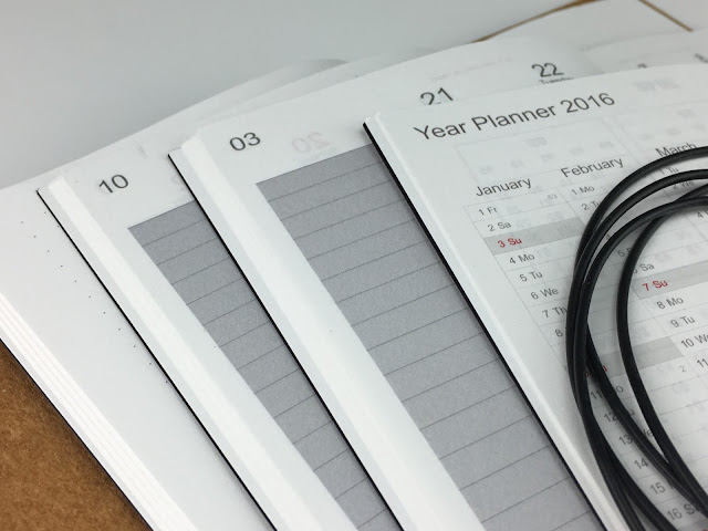
The benefit of using booklets in a cover is you have the flexibility of being able to change out notes pages, insert your new planner pages in the new year, and remove used pages similar to a ring binder but without the weight and bulk of the metal rings. Here is my Plannerisms planner with my A5 Finsbury leather Filofax. You can see how much smaller the Plannerisms planner is, but with equivalent writing space on the pages.
The other advantage is there are no rings to get in the way of your writing, so you can easily write to the middle of the page.
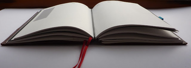
The cover is amazing: the spine is square-ish, and the edges of the booklets do not hang out of the side. It is very neat and tidy.
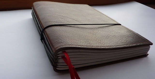
And it lies flat! No self-closing that happens with many other leather covers.
More on the covers in a minute! First, let me tell you all about the Plannerisms planners themselves.
The three Plannerisms booklets consist of 1) month on two pages calendars with notes pages between, Annual and Quarterly Goals 2) Weekly pages January-June, and 3) Weekly pages July-December.
The booklets measure 142 by 210 mm, so the overall size of the book is A5. The paper is Munken Lynx, which is a natural white, 80 gsm. It's all of the highest quality. I absolutely love the clean, elegant design.
The Plannerisms planner is designed for maximum flexibility of use. It's not prescribed, so you don't have to use it in a particular way. Use it however works best for you. The formats can be used in multiple ways, so it's great for anyone no matter what you do. It's designed to help you incorporate goal tasks into daily actions by breaking down your big annual goals into quarterly and monthly goals, then to weekly and daily tasks.
Here is a tour through the planner! Click on photos for a larger view.
I'll start with the first booklet, which has months and goals pages. The first page has space to write personal information:
Next there are overview calendars for the current year and the future year:
Next there is an overview calendar for the whole year at a glance. This is a great place to note big events like major deadlines, holidays, and travel. It's also great for tracking things like weight, blood pressure, miles run, etc.
Next there is a two-page spread to write your goals for the year. I'll have more posts soon on ways to use the Goals pages in the planner.
Next there are pages to write your Quarterly Goals to help you focus on actions you can accomplish in three-month periods.
Next come the monthly pages. The clean, open design gives you maximum writing space. The shaded column at the left can be used for anything you need: weekly focus, budget totals, reminders of big events, etc.
The weeks begin with Mondays. Monday starts keep the weekends together, and correspond exactly to the weeks in the weekly sections. I know many people in the US are used to their monthly calendars having Sunday-start weeks. If you really want your calendar's weeks to start with Sunday, it's easy to turn that shaded column into your Sundays and use the Sunday column for your notes.
Between every month there is a two-page spread for notes. In previous years of the Plannerisms planner, there was debate among customers as to whether they wanted the notes pages before or after the corresponding month. In this version, we let you decide how to use them. There are notes pages before January, between each month, and after December. They are not designated to a particular month, so you can use the pages before or after to correspond with your month.
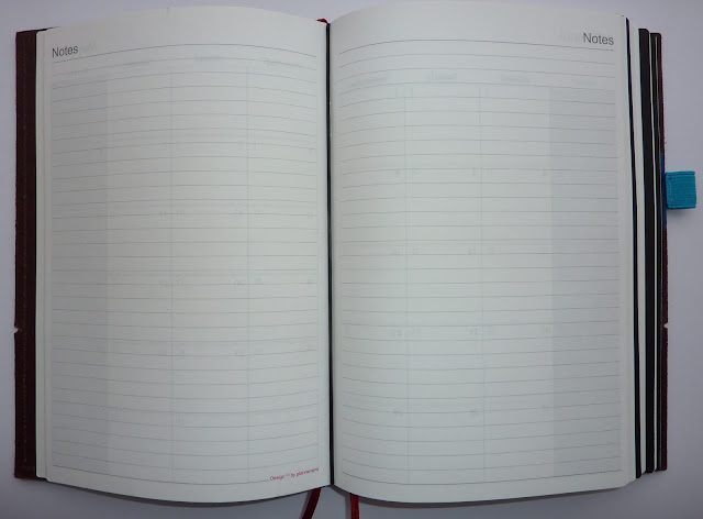
The notes pages between the months are where you break down annual and quarterly goals into your monthly goals and targets. This also gives you space to track your goals (more on that in future posts). You can write notes, outline your budget, do mind maps or master lists, or anything you want on these pages.
The last two-page spread in the booklet is a year overview of the future year. This gives you a place to record upcoming events and appointments into the new year.
The last page is for Contacts. This is a handy spot for frequently used numbers or other information.
The next booklet has the weeks January-June. The first page is a reference calendar for the current year.
The weekly pages are designed to give you maximum writing space for your schedule, tasks, lists and notes. The daily columns are delineated by gaps between the lines. (Note, we have already had a request for lines between the day columns, would you prefer this or do you like no vertical lines? Please vote in the poll at the top of the sidebar!) This gives you the freedom to write scheduled events, lists and notes, and carry things over to multiple days (for example if a conference or trip covers multiple days, you can write it straight across those days). If you need more lines for your days, you can write down into the lists area below.
Below the daily columns are lines for writing your task lists or notes. This is where I write my categorized lists.
Update: there will be lines between the daily columns, like this:
Below is an example of how I use the weekly pages. Again this is just how I use them, you can use them any way you like.
I put the week's goals and things to do daily (or nearly daily) in the shaded column at the left. In the day columns I draw a box around appointments/ scheduled events, and use a dot or asterisk to indicate tasks to be done on a specific day. I use a sticky note for garbage/ recycling days since those alternate each week. I also make a note above an event if I need to bring something.
In the space below the days I write my categorized task lists for work and personal. I use a box for tasks where an empty box means I haven't started the task; a partly-filled box means it's in progress; and a filled box means it's complete. I don't write all the steps because I can remember what still needs to be done (for example if I need to load photos for the blog post, etc.).
The space below the days is so open and free, you can use it as one big space if you like, or divide it as I do. I'll have another post soon with more tips and ideas on ways to use the weekly pages.
Holidays for US and European countries are indicated on the days with the country symbol, with the details of the holiday above. This means you don't have to write your holidays in yourself, while still leaving maximum writing space. Moon phases are also indicated.
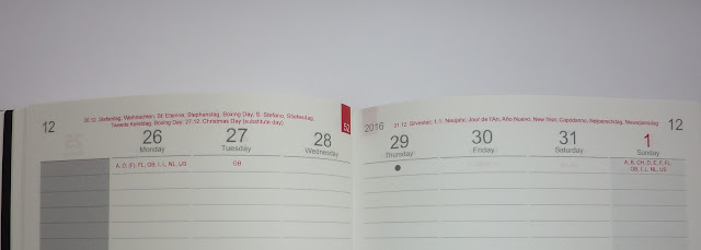
At the end of the January-June booklet there is space to write your half-year review. This is where you go back and evaluate your progress toward your annual goals. You can note any roadblocks, and think of ways to work through them to maximize your productivity for the rest of the year.
The end of the July-December booklet has pages for your annual review. This is where you evaluate your annual goals, celebrate what you accomplished, discard what became irrelevant, and decide what to focus on in the coming year.
The very last page in each of the weekly booklets is a notes page. Here you can carry over your reviews, draw a mind map, write summaries, or anything else you like.
Update: since the planners will ship directly from the company in Germany, you will be able to choose any of their covers including leather, recycled, and man-made materials. You will also be able to choose from any of their accessories, additional notes booklets, etc. More on that below:
This is the brown vegetable dyed Belgian leather cover, I love it. It has a great rugged look, feels wonderful, and has that great leather smell. It's held shut with an elastic, and I added a stick-on pen loop. I also added a red ribbon placemarker that easily loops through the cover's elastics. It creates a double bookmark so you can mark your current month and week. There are loads of ribbon colors to choose from, click here to see them and click on all three images to see all the color families. There are other accessories available like pockets, pen loops (in lots of colors), replacement elastics etc.
Here are the websites that show the Belgian vegetable dyed leathers, and the Italian leathers in various colors.
There are also recycled leather covers that are a more affordable option. The black recycled leather one looks professional and classy in any circumstances. The uncoated Graphite and Natural ones are very nice too. Here are some photos of those three:
Below is an image showing all the leather cover options. (Click on the image to enlarge.)
There are some non-leather, inexpensive options too: polypropylene in lots of color choices, or a moleskine-like black cover.
Below is a look at the entire Plannerisms package!
Let me take a moment to thank everyone for all of your support throughout the years in making my planner dream come true. I appreciate everyone who has ever bought a Plannerisms planner and sent me supportive words throughout this whole process.
And enormous thanks to Matthias at X17 who reached out to me to publish the Plannerisms planners this year! Thank you Matthias for making this happen!
Click here for ordering information.
These are the first-run samples. The final products are now shipping! Click here for ordering information. Only 100 were printed, and when they are gone they are gone! So if you want one, act fast!

The 2016 Plannerisms planners are published by X17, a German company that makes planner and notes booklets that fit into gorgeous covers. Their products are top quality, and I am extremely happy to be working with them on the new Plannerisms planners!
The 2016 Plannerisms planners will be available to ship worldwide. All stock will be available to ship from Germany to locations worldwide. I don't have the shipping price info yet but I will let you know when I do.
Just like in years past the 2016 Plannerisms planners will have month on two page grid calendars with notes pages between each month; weekly pages with space to write lists and goals; pages to write Annual, Quarterly and Monthly goals, and more. The weekly pages have holidays printed for the US and European countries, and moon phases
The 2016 Plannerisms planners are in three booklets that fit into a cover, held by elastics. The Plannerisms set will also come with a notes booklet with dotted, numbered pages. This allows you the flexibility to add notes, sketches, contacts or anything you need, and when that booklet fills up you can replace it. Each cover holds four booklets, allowing you to keep your entire year of monthly and weekly pages plus notes together in your book. Here is a video that shows how the booklets go in the cover.

The benefit of using booklets in a cover is you have the flexibility of being able to change out notes pages, insert your new planner pages in the new year, and remove used pages similar to a ring binder but without the weight and bulk of the metal rings. Here is my Plannerisms planner with my A5 Finsbury leather Filofax. You can see how much smaller the Plannerisms planner is, but with equivalent writing space on the pages.
The other advantage is there are no rings to get in the way of your writing, so you can easily write to the middle of the page.
The cover is amazing: the spine is square-ish, and the edges of the booklets do not hang out of the side. It is very neat and tidy.

And it lies flat! No self-closing that happens with many other leather covers.

More on the covers in a minute! First, let me tell you all about the Plannerisms planners themselves.
The three Plannerisms booklets consist of 1) month on two pages calendars with notes pages between, Annual and Quarterly Goals 2) Weekly pages January-June, and 3) Weekly pages July-December.
The Plannerisms planner is designed for maximum flexibility of use. It's not prescribed, so you don't have to use it in a particular way. Use it however works best for you. The formats can be used in multiple ways, so it's great for anyone no matter what you do. It's designed to help you incorporate goal tasks into daily actions by breaking down your big annual goals into quarterly and monthly goals, then to weekly and daily tasks.
Here is a tour through the planner! Click on photos for a larger view.
Next there are overview calendars for the current year and the future year:
Next there is an overview calendar for the whole year at a glance. This is a great place to note big events like major deadlines, holidays, and travel. It's also great for tracking things like weight, blood pressure, miles run, etc.
Next there is a two-page spread to write your goals for the year. I'll have more posts soon on ways to use the Goals pages in the planner.
Next there are pages to write your Quarterly Goals to help you focus on actions you can accomplish in three-month periods.
Next come the monthly pages. The clean, open design gives you maximum writing space. The shaded column at the left can be used for anything you need: weekly focus, budget totals, reminders of big events, etc.
The weeks begin with Mondays. Monday starts keep the weekends together, and correspond exactly to the weeks in the weekly sections. I know many people in the US are used to their monthly calendars having Sunday-start weeks. If you really want your calendar's weeks to start with Sunday, it's easy to turn that shaded column into your Sundays and use the Sunday column for your notes.
Between every month there is a two-page spread for notes. In previous years of the Plannerisms planner, there was debate among customers as to whether they wanted the notes pages before or after the corresponding month. In this version, we let you decide how to use them. There are notes pages before January, between each month, and after December. They are not designated to a particular month, so you can use the pages before or after to correspond with your month.

The notes pages between the months are where you break down annual and quarterly goals into your monthly goals and targets. This also gives you space to track your goals (more on that in future posts). You can write notes, outline your budget, do mind maps or master lists, or anything you want on these pages.
The last two-page spread in the booklet is a year overview of the future year. This gives you a place to record upcoming events and appointments into the new year.
The last page is for Contacts. This is a handy spot for frequently used numbers or other information.
The next booklet has the weeks January-June. The first page is a reference calendar for the current year.
The weekly pages are designed to give you maximum writing space for your schedule, tasks, lists and notes. The daily columns are delineated by gaps between the lines. (Note, we have already had a request for lines between the day columns, would you prefer this or do you like no vertical lines? Please vote in the poll at the top of the sidebar!) This gives you the freedom to write scheduled events, lists and notes, and carry things over to multiple days (for example if a conference or trip covers multiple days, you can write it straight across those days). If you need more lines for your days, you can write down into the lists area below.
The shaded area at the left is where you write your daily intentions, so you don't have to re-write them every day. (Note, we have already had lots of requests for this shaded area to be lighter so we will definitely do that.) I like to write daily goals there and then just check them off or fill them in as I go.You can use this area any way you wish. You can write a quote for the week, write your weekly review, gratitude, week's focus, or more list space.
Below the daily columns are lines for writing your task lists or notes. This is where I write my categorized lists.
Update: there will be lines between the daily columns, like this:
Below is an example of how I use the weekly pages. Again this is just how I use them, you can use them any way you like.
I put the week's goals and things to do daily (or nearly daily) in the shaded column at the left. In the day columns I draw a box around appointments/ scheduled events, and use a dot or asterisk to indicate tasks to be done on a specific day. I use a sticky note for garbage/ recycling days since those alternate each week. I also make a note above an event if I need to bring something.
In the space below the days I write my categorized task lists for work and personal. I use a box for tasks where an empty box means I haven't started the task; a partly-filled box means it's in progress; and a filled box means it's complete. I don't write all the steps because I can remember what still needs to be done (for example if I need to load photos for the blog post, etc.).
The space below the days is so open and free, you can use it as one big space if you like, or divide it as I do. I'll have another post soon with more tips and ideas on ways to use the weekly pages.
Holidays for US and European countries are indicated on the days with the country symbol, with the details of the holiday above. This means you don't have to write your holidays in yourself, while still leaving maximum writing space. Moon phases are also indicated.

At the end of the January-June booklet there is space to write your half-year review. This is where you go back and evaluate your progress toward your annual goals. You can note any roadblocks, and think of ways to work through them to maximize your productivity for the rest of the year.
The end of the July-December booklet has pages for your annual review. This is where you evaluate your annual goals, celebrate what you accomplished, discard what became irrelevant, and decide what to focus on in the coming year.
The very last page in each of the weekly booklets is a notes page. Here you can carry over your reviews, draw a mind map, write summaries, or anything else you like.
This is the brown vegetable dyed Belgian leather cover, I love it. It has a great rugged look, feels wonderful, and has that great leather smell. It's held shut with an elastic, and I added a stick-on pen loop. I also added a red ribbon placemarker that easily loops through the cover's elastics. It creates a double bookmark so you can mark your current month and week. There are loads of ribbon colors to choose from, click here to see them and click on all three images to see all the color families. There are other accessories available like pockets, pen loops (in lots of colors), replacement elastics etc.
Here are the websites that show the Belgian vegetable dyed leathers, and the Italian leathers in various colors.
There are also recycled leather covers that are a more affordable option. The black recycled leather one looks professional and classy in any circumstances. The uncoated Graphite and Natural ones are very nice too. Here are some photos of those three:
Below is an image showing all the leather cover options. (Click on the image to enlarge.)
There are some non-leather, inexpensive options too: polypropylene in lots of color choices, or a moleskine-like black cover.
Below is a look at the entire Plannerisms package!
Let me take a moment to thank everyone for all of your support throughout the years in making my planner dream come true. I appreciate everyone who has ever bought a Plannerisms planner and sent me supportive words throughout this whole process.
And enormous thanks to Matthias at X17 who reached out to me to publish the Plannerisms planners this year! Thank you Matthias for making this happen!
Click here for ordering information.
Subscribe to:
Posts (Atom)


