These are the first-run samples. The final products are now shipping! Click here for ordering information. Only 100 were printed, and when they are gone they are gone! So if you want one, act fast!
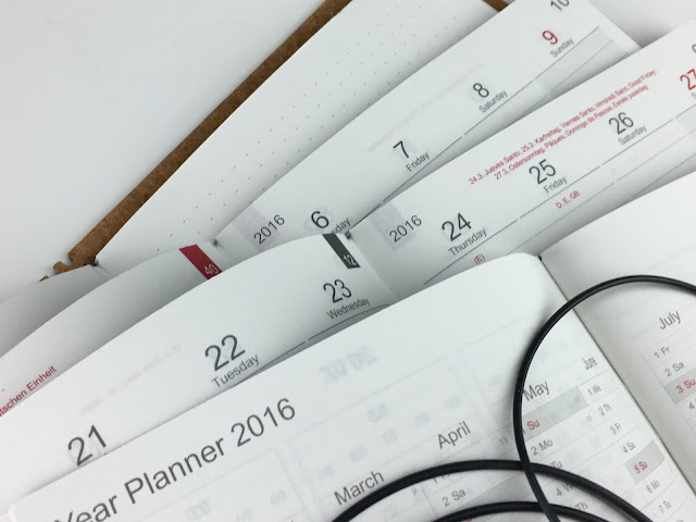
The 2016 Plannerisms planners are published by X17, a German company that makes planner and notes booklets that fit into gorgeous covers. Their products are top quality, and I am extremely happy to be working with them on the new Plannerisms planners!
The 2016 Plannerisms planners will be available to ship worldwide. All stock will be available to ship from Germany to locations worldwide. I don't have the shipping price info yet but I will let you know when I do.
Just like in years past the 2016 Plannerisms planners will have month on two page grid calendars with notes pages between each month; weekly pages with space to write lists and goals; pages to write Annual, Quarterly and Monthly goals, and more. The weekly pages have holidays printed for the US and European countries, and moon phases
The 2016 Plannerisms planners are in three booklets that fit into a cover, held by elastics. The Plannerisms set will also come with a notes booklet with dotted, numbered pages. This allows you the flexibility to add notes, sketches, contacts or anything you need, and when that booklet fills up you can replace it. Each cover holds four booklets, allowing you to keep your entire year of monthly and weekly pages plus notes together in your book. Here is a video that shows how the booklets go in the cover.
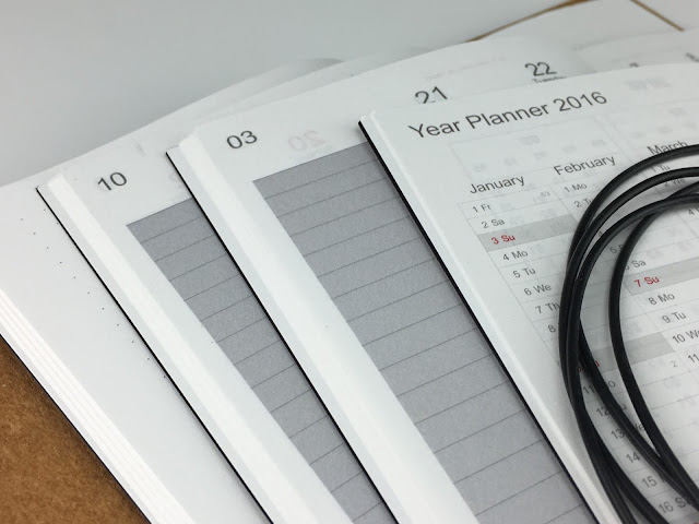
The benefit of using booklets in a cover is you have the flexibility of being able to change out notes pages, insert your new planner pages in the new year, and remove used pages similar to a ring binder but without the weight and bulk of the metal rings. Here is my Plannerisms planner with my A5 Finsbury leather Filofax. You can see how much smaller the Plannerisms planner is, but with equivalent writing space on the pages.
The other advantage is there are no rings to get in the way of your writing, so you can easily write to the middle of the page.
The cover is amazing: the spine is square-ish, and the edges of the booklets do not hang out of the side. It is very neat and tidy.
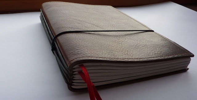
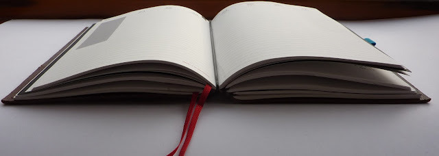
And it lies flat! No self-closing that happens with many other leather covers.
More on the covers in a minute! First, let me tell you all about the Plannerisms planners themselves.
The three Plannerisms booklets consist of 1) month on two pages calendars with notes pages between, Annual and Quarterly Goals 2) Weekly pages January-June, and 3) Weekly pages July-December.
The Plannerisms planner is designed for maximum flexibility of use. It's not prescribed, so you don't have to use it in a particular way. Use it however works best for you. The formats can be used in multiple ways, so it's great for anyone no matter what you do. It's designed to help you incorporate goal tasks into daily actions by breaking down your big annual goals into quarterly and monthly goals, then to weekly and daily tasks.
Here is a tour through the planner! Click on photos for a larger view.
Next there are overview calendars for the current year and the future year:
Next there is an overview calendar for the whole year at a glance. This is a great place to note big events like major deadlines, holidays, and travel. It's also great for tracking things like weight, blood pressure, miles run, etc.
Next there is a two-page spread to write your goals for the year. I'll have more posts soon on ways to use the Goals pages in the planner.
Next there are pages to write your Quarterly Goals to help you focus on actions you can accomplish in three-month periods.
Next come the monthly pages. The clean, open design gives you maximum writing space. The shaded column at the left can be used for anything you need: weekly focus, budget totals, reminders of big events, etc.
The weeks begin with Mondays. Monday starts keep the weekends together, and correspond exactly to the weeks in the weekly sections. I know many people in the US are used to their monthly calendars having Sunday-start weeks. If you really want your calendar's weeks to start with Sunday, it's easy to turn that shaded column into your Sundays and use the Sunday column for your notes.
Between every month there is a two-page spread for notes. In previous years of the Plannerisms planner, there was debate among customers as to whether they wanted the notes pages before or after the corresponding month. In this version, we let you decide how to use them. There are notes pages before January, between each month, and after December. They are not designated to a particular month, so you can use the pages before or after to correspond with your month.
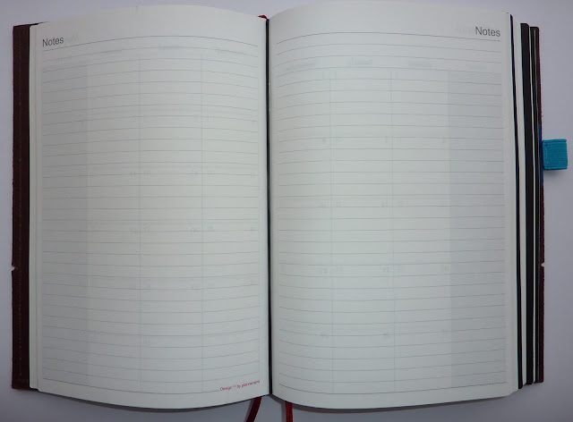
The notes pages between the months are where you break down annual and quarterly goals into your monthly goals and targets. This also gives you space to track your goals (more on that in future posts). You can write notes, outline your budget, do mind maps or master lists, or anything you want on these pages.
The last two-page spread in the booklet is a year overview of the future year. This gives you a place to record upcoming events and appointments into the new year.
The last page is for Contacts. This is a handy spot for frequently used numbers or other information.
The next booklet has the weeks January-June. The first page is a reference calendar for the current year.
The weekly pages are designed to give you maximum writing space for your schedule, tasks, lists and notes. The daily columns are delineated by gaps between the lines. (Note, we have already had a request for lines between the day columns, would you prefer this or do you like no vertical lines? Please vote in the poll at the top of the sidebar!) This gives you the freedom to write scheduled events, lists and notes, and carry things over to multiple days (for example if a conference or trip covers multiple days, you can write it straight across those days). If you need more lines for your days, you can write down into the lists area below.
The shaded area at the left is where you write your daily intentions, so you don't have to re-write them every day. (Note, we have already had lots of requests for this shaded area to be lighter so we will definitely do that.) I like to write daily goals there and then just check them off or fill them in as I go.You can use this area any way you wish. You can write a quote for the week, write your weekly review, gratitude, week's focus, or more list space.
Below the daily columns are lines for writing your task lists or notes. This is where I write my categorized lists.
Update: there will be lines between the daily columns, like this:
Below is an example of how I use the weekly pages. Again this is just how I use them, you can use them any way you like.
I put the week's goals and things to do daily (or nearly daily) in the shaded column at the left. In the day columns I draw a box around appointments/ scheduled events, and use a dot or asterisk to indicate tasks to be done on a specific day. I use a sticky note for garbage/ recycling days since those alternate each week. I also make a note above an event if I need to bring something.
In the space below the days I write my categorized task lists for work and personal. I use a box for tasks where an empty box means I haven't started the task; a partly-filled box means it's in progress; and a filled box means it's complete. I don't write all the steps because I can remember what still needs to be done (for example if I need to load photos for the blog post, etc.).
The space below the days is so open and free, you can use it as one big space if you like, or divide it as I do. I'll have another post soon with more tips and ideas on ways to use the weekly pages.
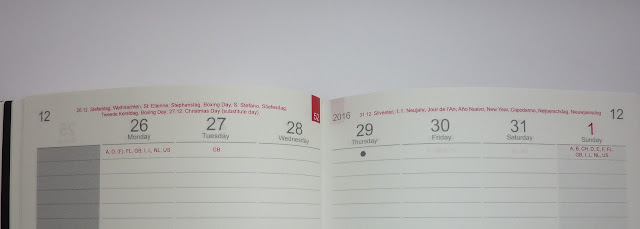
Holidays for US and European countries are indicated on the days with the country symbol, with the details of the holiday above. This means you don't have to write your holidays in yourself, while still leaving maximum writing space. Moon phases are also indicated.
At the end of the January-June booklet there is space to write your half-year review. This is where you go back and evaluate your progress toward your annual goals. You can note any roadblocks, and think of ways to work through them to maximize your productivity for the rest of the year.
The end of the July-December booklet has pages for your annual review. This is where you evaluate your annual goals, celebrate what you accomplished, discard what became irrelevant, and decide what to focus on in the coming year.
The very last page in each of the weekly booklets is a notes page. Here you can carry over your reviews, draw a mind map, write summaries, or anything else you like.
This is the brown vegetable dyed Belgian leather cover, I love it. It has a great rugged look, feels wonderful, and has that great leather smell. It's held shut with an elastic, and I added a stick-on pen loop. I also added a red ribbon placemarker that easily loops through the cover's elastics. It creates a double bookmark so you can mark your current month and week. There are loads of ribbon colors to choose from, click here to see them and click on all three images to see all the color families. There are other accessories available like pockets, pen loops (in lots of colors), replacement elastics etc.
Here are the websites that show the Belgian vegetable dyed leathers, and the Italian leathers in various colors.
There are also recycled leather covers that are a more affordable option. The black recycled leather one looks professional and classy in any circumstances. The uncoated Graphite and Natural ones are very nice too. Here are some photos of those three:
Below is an image showing all the leather cover options. (Click on the image to enlarge.)
There are some non-leather, inexpensive options too: polypropylene in lots of color choices, or a moleskine-like black cover.
Below is a look at the entire Plannerisms package!
Let me take a moment to thank everyone for all of your support throughout the years in making my planner dream come true. I appreciate everyone who has ever bought a Plannerisms planner and sent me supportive words throughout this whole process.
And enormous thanks to Matthias at X17 who reached out to me to publish the Plannerisms planners this year! Thank you Matthias for making this happen!
Click here for ordering information.


Hi Laurie,
ReplyDeleteFirst of all I am very happy for you that you managed to get the plannerisms planner out for 2016 after all and that too in such a innovative way with a German company.
Love the fact it lays flat open! I had the issue with the 2014 hard bound version closing on itself.
For changes I totally agree with the suggestions mentioned in the post
1) left-hand side to be lighter shade. I saw the accompanying video and have to say it does look quite dark. also having vertical lines (in the gaps) even if faint would really help with differentiating the days especially if one is planning on the go. That's one feature I really liked about the previous layout...not having the vertical lines between the days would cause me to accidentally write under a different column date if I am in a hurry.
Side note: would we be able to purchase the booklets without having to get a cover?
Hi Laurie, wow! The dori system is really taking off. It's incredible to see a true planner made with lovely leather covers. I'd love to try one of your planners - you have a great eye for detail and these are all important sections. This planner is all set up with all sorts of awesome features I'd love to give a try :) I love the C, B, and D covers. I agree with Tea's points: lighter column and lines dividing the columns would be great! :)
ReplyDeleteHi Laurie, I love the travelers notebook style of the planner. I agree that the grey area should be lighter. I wouldn't need any lines between the days if any, I would prefer very faint line.
ReplyDeleteI love the D , B, M and P covers.
I am glad you were able to get a planner out this year. I must say though, I'm disappointed. I came across your blog a couple weeks ago on my mad search to find the perfect planner and I thought I had found it in the images, YouTube video, and reviews of the older planners. This one, while still having components that I like (notes, goals and review of goals, vertical weekly layout with space for lists, no times listed in the weekly layout, simplistic design of page layouts), it just isn't what I thought was coming. I liked the vegan cover with the little moon, the weekly layout (with unlined space at the bottom for notes or doodles), and the fact that it was bound. I was looking forward to this planner coming out, assuming it'd be very similar to past years. My search continues.
ReplyDeleteAs for suggestions on what's here, I like what was already suggested. That grey space is a wee bit dark and lines between the days would be beneficial if I were to use this.
Although this isn't what I was going for, I can still say thank you for all the information on this blog. It has really helped me identify what I'm looking for in a planner.
Lindsey
How did I ever miss this? I happened upon the video and was watching with my mouth hanging open.. clearly I've been playing too much candy crush on facebook instead of reading posts... emailing you now.....
ReplyDeleteThese look great! I agree with the idea of making the shaded areas lighter and don't think lines between days are necessary, they can always be added by the user if they need them (skinny washi anyone?) the leathers are gorgeous but a colour may be a fun option too. Great work Laurie! Glad you were able to find a new publisher.
ReplyDeleteI agree with making the shaded area on the weekly page a tad lighter. I like the openness to make it boundary-free. I am so glad you were able to get this up and running again and can I say even happier that I will be able to order from Amazon! The vegetable tanned leather covers look divine and I am also sure your readers will be grateful for all of the options and affordability these will offer. Great work and looking forward to trying this out. By the way, I was ecstatic when you mentioned they would lay flat! Holy Cow, that makes me so happy!
ReplyDeletePlease let's also have some coloured cover options (non-leather)! Also, it is the first time I come across a booklet thing...is it possible to remove one or more of them if necessary?
ReplyDeleteYes the booklets can be added and removed individually. You can watch the video linked in the post above to see exactly how it's done.
DeleteI discover tris brand couple of month ago. I also have a post about the X47 thai is the model that the company suggest me. I think that respect al the X47, the X17 Is more "easy" to costumize.
ReplyDeleteI have a weekly planner for 2016 and I'd like to have your monthly insert as well. May I buy that book only?
ReplyDeleteMy name is Cristina :-)
DeleteMy name is Cristina :-)
DeleteHi Cristina, sorry but the monthly booklets are not available to purchase separately. However the notes booklets are available to buy replacements, I've had several people ask about those. Here is the link: http://www.x17-shop.de/index.php?page=product&info=19
DeleteI have a weekly planner for 2016 and I'd like to have your monthly insert as well. May I buy that book only?
ReplyDeleteWhat is the weight of the paper? From the picture, it looks like you can see images from the other side. I'm worried about my pen bleeding through.
ReplyDeleteIt is 80 gsm, and not coated. I don't have fountain pens so I can't do tests for you, sorry.
DeleteWhat is the weight of the paper? From the picture, it looks like you can see images from the other side. I'm worried about my pen bleeding through.
ReplyDeleteHello! D, B, G, P
ReplyDeleteI love it except for me, the week starts on Sunday. Any way to have some undated planners? But I do love it
ReplyDeleteThe X17/X47 products are fantastic quality and this will be too! "Less is more" these days and I feel that not having fixed hours and not having vertical lines between days allows for maximum flexibility. It's easy enough to add these in pencil if you need them! Equally anyone wanting a Sunday start can easily re-jig the columns - as long as the left column is only shaded lightly.
ReplyDeleteMy main concern is the bulk of the three/four books in the MTN style cover. It will be a lot chunkier than the previous Plannerisms.
I LOVE the TN style with the inserts. Question - can one order the TN structure only (no inserts?) It beats making one! Plus I like your design. I'd buy the monthly insert but don't use a weekly.
ReplyDeleteYes you can get just the covers: http://www.x17-shop.de/index.php?page=categorie&cat=71
DeleteThis is a STUNNING setup! I've always admired the X17 style products and I'm very glad you were able to get your 2016 planner made by them.
ReplyDeleteA good compromise regarding lines on the weekly pages could be that, if you add the lines, they be faint grey or dotted lines.
Looks amazing any idea on price point yet?
ReplyDeleteI honestly don't know yet. We are still deciding how many to print. The more we print, the lower the overall cost of course, but we also don't want to print too many and not sell enough. So we are still deciding volume, which will affect price. I'll be sure to have prices up here on the blog as soon as I know.
DeleteI love the look of these; I'm definitely in love and use my TN all the time, since I discovered it. I do prefer (or create) a line or margin between each section/day otherwise I mentally merge it all together.
ReplyDeleteThank you for all of your input everyone!
ReplyDeleteHi Laurie,
ReplyDeleteI'm a newcomer to your blog but did want to say, I love the look of this new planner. it's so clean and well designed. I do like my monthly pages in front of the week pages, month by month; but I think I must be alone in this because they rarely come that way. I also like the idea that I could remove the booklet holding the week pages to go out to my studio when I'm working. I have two separate buildings on my property. Or for the first time ever, thinking of having a planner in the studio and another one in the hoouse office.
I am curious about price, I have no idea what this would cost to be able to even consider it.
I've used planners on and off for years and just recently learned there is this whole world of people so devoted to them, such as yourself.
Oh, and I think I'd like a light line between the days of the week.
That's a very good point actually, it's easy to take with you just the booklet you need and keep the rest on your desk. Each booklet is very slim and light.
DeleteCongratulations, Laurie, they're brilliant! I love the design and layout, the solution to the notes before or after the monthly grid, and the dot grid notebook. I agree that the grey should be lightened, but other than that, they're brilliant!!
ReplyDeleteWill they be purchaseable without the cover?
I will ask for that to be an option. Thank you for your kind words!
DeleteIf you could triple check the dates/days correspondence (I didn't receive my money back from last year :( still)....it is a beautiful useful product!!!! I think this planner has it all!!!!!!!
ReplyDeleteHi Suzanne, sorry to hear you didn't get your money back from last year. I actually did none of the shipping/ customer service etc, that was all done via the selling company Collins. I am no longer affiliated with them. You will need to contact them directly regarding your refund. Good luck!
DeleteWhat a great product! I missed the Plannerisms planner this year. As a result I have been using the bullet journal and missing some type of weekly format. This seems like the best of both works. :)
ReplyDeleteI vote for having a very faint line between each day. Looking forward to ordering one of these!
Worlds not works. Ugg, I wish I could edit my post. :)
DeleteThanks Beth!
DeleteThank you.... Nearly All is perfect.... Me would love to have off white paper, it looks so good..., instead of white...( this so maskulin)
ReplyDeleteAnd i hope the new book is smal enouhg to carry in my handbag
Great job!
Hi Laurie!! Yippee - love your new planner and can't wait to purchase one! I too would like faint lines between the days and I love the Italian colorful covers! The beautiful colors make me happy to do work in the pages between the covers! Great job - and also delighted with the Amazon option as I live in the US.
ReplyDeleteHi Laurie,
ReplyDeleteI came upon your blog after a *very* extensive search for a planner. And this is it! Love it! Truly awesome design, and I can appreciate all the effort and thought involved. Please sign me up to be notified when you have the link to Amazon. Can't wait!
-Ana
Hi Laurie,
ReplyDeletecongratulations! so great that the plannerism planner will be out again next year, and what a brilliant new system. it looks brilliant, and i like very much that it is a refill system.
a couple of questions, though [and forgive me if these have been answered elsewhere]:
- is there any option for a man-made or recycled cover?
- do you have any plans to use recycled paper for future plannerism planners?
Thanks Wasi! :)
DeleteTo answer your questions: We are still deciding which covers to offer, but I will put forward the request for non-leather. Meanwhile the recycled leather covers are made with leather offcuts from the shoe industry, which would otherwise end up in the landfill so those are a good recycled option.
You are the first to request recycled paper, but it's definitely something to think about for the future.
Thanks for your suggestions!
Hi Laurie,
DeleteThanks for getting back! That's really good to know about the leather covers - I didn't think of offcuts!
The recycled paper is something I've been thinking of mentioning the past few years. It didn't stop me from getting my plannerisms planners in 2013 and 2014, but this year I opted for a planner made of fully recycled paper and card from Etsy.
For 2016, I'd already got [and given away!] two fully recycled material planners, one being the Kalen-diar, and another from deaf messenger, but neither were quite right in terms of layout.
I think I'll be back to the Plannerisms, because it really is the closest to what's in my head as the perfect layout [unless I finally make my own...].
Best wishes for rolling them out - looking forward to getting one!
Hi how can we place order fro this 2016 planner? . i am from singapore
ReplyDeleteThese will be available to order online soon! I will announce here on Plannerisms when the ordering website is ready.
Deletethank you very much as i tried to do some search on the producer xt but to no avail i cannot see they have planner layout like yours . i so like the way the layout now unfortunately i cheak out planners moleskine they missing some features i need .
DeleteHi, Laurie: Do you know yet whether the planners will be available in December? I can't wait to get my hands on one! You have put a lot of thought into them - and it shows. I vote for the lighter gray in the weekly section, lines or no lines between days is OK as each has its advantages, and I love the leather cover (the brown Belgian vegetable dyed cover is yummy!) so hope you will include that as an option.
ReplyDeletewhere can i place order now for you 2016 planner ? is there a link to the order web
ReplyDeleteThey are not ready to order yet. I should have the link to the ordering website in the next few days. I will have the link on Plannerisms.com as soon as it is ready, so keep checking! Thank you for your interest!
Deleteeverything is in German some pages ask if you want it translated but not all pages. Also it doesnt give you an option to have then planners written in English. Not a good website. I like the planners but am not going to risk it.
ReplyDeleteHi GlamourGirl, look to the right of the page and click on the British flag to translate the page into English. The original language is German and they did the translation for the Plannerisms website pages so that non-German speakers can order.
ReplyDelete(The planners themselves are all in English!)
DeleteOh n-o-o-o-o Laurie! I unsubscribed from Plannerisms for a bit because I was working with a Bullet Journal from autumn last year (update: fed up having to draw my own diary every month or so!), and recently decided to try and switch to a Midori style planner. You've only gone and made one, along with the core aspects that made your original planner so good. This looks like a really amazing solution, and I'll definitely order one in 2017! (Kicking myself... )
ReplyDelete