Here is an excellent guest post from Christine, who graciously agreed to review her Ecojot planner. I have heard of Ecojot before but have never seen one in person, so I was very interested in her review! Many thanks to Christine!
My name is Christine and I live in Toronto, Canada. I highly value ecologically-conscious products, which, as far as paper goes, can still be hard to find where I live. Originally from Germany, I grew up with an abundance of beautiful grey, 100% recycled paper products. Yes, I actually want my paper to be unbleached, but I yet have to even see it in Canada.
In 2007, I first discovered Ecojot, a Toronto-based company whose 100% post-consumer-recycled paper products are visually enhanced by local designer Carolyn Gavin. At that time, the company made only one size of planners; the one I will introduce you to. Today, Ecojot also produces a smaller size, which measures 5 by 7 inches.
The planner I own measures 6 by 9 inches and weighs at this point (after having taken out a few pages and having had its elastic band removed) 454 grams, or one pound. To sidetrack for a moment: to verify the conversion from European to American measurements, I quickly consulted my Moleskine planner. I repeatedly scanned their conversion table without finding what I needed. Hmmm....
The Ecojot cover consists of sturdy cardboard, printed with one of Carolyn’s designs. There are always at least two designs to choose from. Mine features flowers and birds, and the bottom reads “Rethink. Renew. Re-Use. Recycle.” Well-said.
The cover held up surprisingly well throughout my use of this agenda, without any bending. The back cover, however, got warped inwards as if through water damage (not the case though). I don’t know if I caused this to happen or if this is a general problem. It didn’t bother me though.
The planner’s metal spiral binding has come apart at each end; again, this may or may not be caused by my mishandling.
Now let’s go inside, shall we?
When you open the cover, you’ll find a monthly overview of the year. Please excuse my drawings and attempts of removing personal info via Photoshop. :)
I don’t think I ever referred to this mini calendar at the front. The fact that there is no way to add information renders its use rather limited. Also, the print is rather faint and the numbers so small, which makes it hard to see. If they were to redesign this page, I’d remove the big Ecojot logo at the bottom to allow for more space. Ideally, the personal info section would get moved over to the inside of the cover, but I don’t know if printing this would be technically more difficult.
Turning the page, one gets instantly thrown into the first week. Which is fine, depending on your needs. But I feel the need for some transition, which of course could include a more spacious monthly overview. One reason the company may have chosen to skip this could be the fact that this is an undated planner. This, too, has pros and cons. I happened to start using this planner in late February of 2008, welcoming this feature. I actually enjoyed filling in all the dates. But since the tiny first-page calendar is dated, I figure they might as well make it larger with spaces, hence more usable.
The pages are organized into Monday, Tuesday, Wednesday on the left and the remainder on the right, splitting a row into Saturday and Sunday (in English, French and Spanish). This provided enough room for me, but one thing I often missed was space to record notes not specific to a certain day of the week. Those who actually use the time-lines here may be disappointed that your hours available are from 7am to 6pm, at full-hour intervals. I also found it irritating at times to have the Ecojot logo appear on each page. It’s almost like constant advertising, which seems ironic given the ideology behind a recycled product.
The paper is thick and sturdy, much thicker than say that used in Moleskine planners. It’s white with tiny, hardly visible specks at times. One side is smoother than the other. This never bothered me, however, it might be an issue for those who use fountain pens. I was happy that my writing rarely showed on the other side, with the exception of dark markers to a small extent.
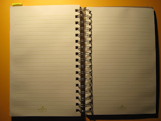
At the back, without transition, you’ll find ruled pages. I’d prefer the lines to extend all the way to the edges, but it’s not a major concern. The bottom is graced, once again, with the Ecojot logo and website. Too much, for my taste. Ecojot gives you a fair number of sheets at the back (they amount to about the same as the rest of the planner). I much prefer this over the few sheets that Moleskine provides - which makes me think five times before I use them for anything.
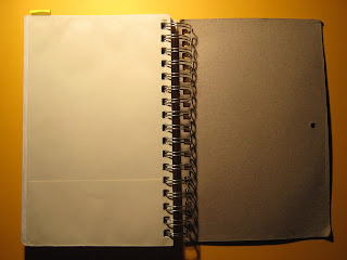
Then, at the very back just before the cover, there are two pockets, which I find much more usable than the Moleskin pockets. It’s made from different paper stock than the rest of this planner; a more obviously recycled, slightly beige, smooth, thick paper with little specks. One pocket on the front, one on the back. Yes, things can fall out more easily than with Moleskines’. But they’re also easier to use; I often carried documents or letters in them on the way to the post office, which I wouldn’t be able to in a Moleskine pocket.
The back cover originally came with a black elastic to wrap around the closed book. My cat, who loves anything dangly, chewed it off. I actually preferred it afterwards.
During my recent visit to NYC, I saw Ecojot products at some small stores (I wish I remembered their names), and I just read online that they’re available at Barnes and Noble. In any case, www.ecojot.com will tell you where to get them. I spent CAN$18 plus tax.
This year, when faced with the question of what kind of planner to choose, I definitely considered Ecojot again. However, in light of the organizational flaws (as I perceive them), I opted for Moleskine, which, it turned out, uses PVC in their covers, a substance I avoid at all cost. If I could reverse my decision, based on my current knowledge of available 100% recycled agendas, I would choose an Ecosystems or Quo Vadis Equology planner. But in the likely event that I move back to Germany next year, I might have more recycled options to choose from than I can handle....


Thanks for posting, Laurie! :)
ReplyDeleteNeedless to say, if/when I go back to Germany, I'll be at your service for more reviews of potentially 'exotic' planners.
Have you ever considered featuring people's DIY planners, for fun?
I would be thrilled to feature people's DIY planners! So if anyone is interested in having their diary/ planner featured here on Plannerisms, send me an email at laurie at plannerisms dot com!
DeleteCount me in! :)
ReplyDeleteI won't be online for a week, which means when I return I'll have so many great posts to read! And I may submit my 2003 DIY-planner for display :)
Great review, Christine. I particularly liked all your colourful doodles. I think it's a pitty that those aren't part of the diary to begin with! I also love that cover, very cheerful.
ReplyDelete