Friday, January 29, 2010
Daycraft Vogue diary review and giveaway!
And now, here is the second in my series of Daycraft giveaways: the mini Vogue diary! This tiny weekly diary measures just 4 3/4 inches by 3 1/4 inches, making it small enough to fit into any purse, clutch or evening bag so you never have to be without your planner. It's perfect for any woman on the go to make plans wherever you are. The hot pink cover with the blue ornament looks very stylish, and the soft-to-touch cover and excellent quality of the book add to the aesthetics. The paper is very nice, acid-free and chlorine free and sourced from sustainable forests.
Edited to add: Daycraft is the #1 brand of diaries and notebooks in Hong Kong, and are looking for a distributor in the US. So the winner of this diary will very likely be the only person in America that has one! Wow!! Now read on...
This book is geared toward people who live in or travel to China and Hong Kong, and has several pages of useful information for these areas including hotel and airline information:
There are pages with public holidays for Hong Kong and China. I have been told that next year the Vogue diaries will have holidays for the US too.
There are several pages with lots of useful information like international dialing codes, time zone information, and conversion charts. There is also a Table of Food calories which is very handy for those who are watching their calorie intake:
There are several useful calendars in the planner. Below you can see the annual planners for 2009-2010-2011:
There are monthly calendars for 2010 and all of 2011:
The weekly spread has plenty of lined, untimed space for each day to write appointments, tasks, phone numbers and info to plan your day.
I love this feature: at the beginning of each month in the weekly section, there is a page with that month's calendar, and space to write reminders for the month, that month's goals, or whatever you like.
At the back of the book there are several pages for notes and contacts. Here is another feature that I love about Daycraft diaries: the last several pages in the book are perforated tear-off mini notes that you can use to jot your phone number, email address, etc. then tear it out and give to someone while you are out and about. That way you are never searching for a scrap of paper to write your information on for someone. Genius!
So if you or someone that you like a lot wants to win this book, here's what you do:
To enter the giveaway, make a comment on this post. Only one entry per person will be counted. You have until midnight EST Monday February 1 to place your entry. On Tuesday February 2 I will select the winner by random number generation--your number will be the order in which your entry was received in the comments. The winner's name will be posted on Plannerisms Tuesday February 2! The winner needs to send me an email with your mailing address. Remember, US people only, no P.O. Boxes. The diary will be mailed via USPS to a US address only (due to my mailing restrictions where I live, sorry.)
Just look at it! It's beautiful!
Good luck!!
The winner of the Daycraft Executive diary is.......
Monday, January 25, 2010
Daycraft Executive diary review and giveaway!
Here is the first of three Daycraft giveaways! This weekly planner/ diary is from the Executive range. This diary is the slim Pocket size, measuring approx. 6 1/2 inches tall and 3 1/2 inches wide. The Executive diaries also come in a smaller Mini size (weekly), slightly larger A6 size (day per page) or for people who need a lot of space for each day, a day-per-page A5 size. Each of these formats and sizes comes in blue (like this diary), pink, light brown, or black.
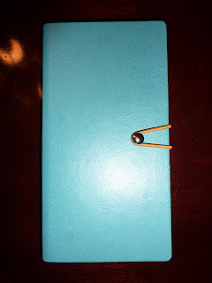
The first thing I noticed about the Executive diary is that it is entirely classy inside and out. It's a great-looking book, very professional yet stylish. There are some exterior details that really make this book stand out. The cover is leather-like and pleasant to touch and hold. On the spine is embossed 2010.
The contrast-colored elastic cord loops around a metal stud to hold the book closed securely. The page edges are colored blue, and there is a matching blue ribbon placemarker.
Inside, the book is absolutely packed with features. This particular book is geared toward people living in Hong Kong or China, and would be extremely useful for anyone living there or traveling there. There are pages of holidays, airline phone numbers and websites, hotels, important and useful telephone numbers, area codes, consulates, etc. for both Hong Kong and China. In the back of the book there are several pages of street maps (and you all know how much I love maps!).
There is also an excellent conversion table which is useful for anyone who needs to convert between US customary units and metric measurements.
This diary also has several very useful calendars throughout the book. There are overview calendars for 2009-2010-2011.
There are also monthly calendars for 2010 and 2011, which are very useful for long-range planning.
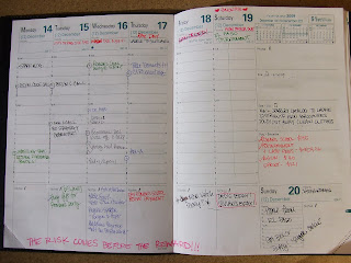
The main part of the diary has a weekly layout with the days and dates in English and Chinese. I have been told that starting next year the Executive diaries will have the US holidays. The daily spaces are lined but not timed, giving you the flexibility to note appointments and tasks. Across the top of the page is a colored bar that is coordinated with the monthly page.
Here is a feature that I really love about Daycraft diaries: in the weekly section, at the beginning of each month there is a page spread with a quote on the left page, and on the right page there is the calendar for that month with lined space covering most of the page. I think this is a great idea.
This monthly page can be used to write your monthly goals, major events or deadlines for that month, things due (for example, if you have a semi-annual insurance payment due that month, or that's the month you are due for your dental exam), whatever else. I really like having this space each month for lists and notes.
In the very back of the book there is a page for your personal information for easy reference. And there are several pages of perforated tear-out mini notes, for those times when you need to give someone your contact information on the go. Excellent feature!
Even if you never go to China or Hong Kong this year, the Executive would be an great diary/planner for the busy person on the go. It is an excellent, stylish planner that is slim enough to fit into any purse.
So now, the giveaway! As reluctant as I am to part with this beautiful book, I think more people should be able to see the style and quality of Daycraft books.
To enter the giveaway, make a comment on this post. Only one entry per person will be counted. You have until midnight EST Thursday January 28 to place your entry. On Friday, January 29 I will select the winner by random number generation--your number will be the order in which your entry was received in the comments. The winner's name will be posted on Plannerisms Friday January 29! The winner needs send me an email with your mailing address. Remember, US people only, no P.O. Boxes. The diary will be mailed via USPS to a US address only (due to my mailing restrictions where I live, sorry.)
So make a comment to place your entry! Good luck!
Sunday, January 24, 2010
Daycraft Sneak Peek: Reviews and Giveaways!
First, a little more about Daycraft: Their logo says, "Daycraft, We make your day." Receiving a box full of these beautiful little books definitely made my day! The catalogue (so generously supplied, full of fantastic photos of their entire product range) says, "Our diaries, notebooks and planners are made to endure for decades as a treasured archive of your thoughts and ideas." Each of these books is special in its own way, and they are definitely meant to be treasured.
Daycraft products are currently available in Hong Kong, China, Korea and Taiwan but at this time they are looking for distributors in the US and Europe. Personally I hope they find distributors for this part of the world very soon, because I fell in love with these little books immediately.
The first thing I noticed was how well-made they are. Everything about them is quality. The paper, the bindings, the covers--all excellent. And, the aesthetics are wonderful. As we all know, I'm a very tactile person, and these little books are so nice to hold and use. Even the best photos don't do these books justice. Holding them in your hands is an experience.
Not only that, but each book has its own personality. These are only a sample of the wide range of styles available from Daycraft. They have sophisticated, they have quirky, they have funky, they have cute. And all of them are very cool.
I will be doing a thorough review of each book in its own separate post complete with interior photos. Below is a quick description of each book (with more details to come in its own review later). Also below I'll point out which of these books will be given away to Plannerisms readers!
The blue diary (below) is from the Executive diary range. It is very classy and sophisticated, and would be great for any busy person who needs to look professional wherever they go but still wants a touch of style. This book measures approx. 6 1/2 inches tall and 3 1/2 inches wide and has a week to view. The Executive range of diaries has a variety of sizes with weekly or daily views. They come in blue (shown here), pink, brown and black. I will do a very thorough review of this diary with lots of photos because it has so many fantastic features. I will be giving this diary away (as I wipe away my tears. It's beautiful.)
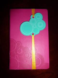
The small pink book is a Vogue diary, for the fashionista. The ornament held on the cover by the ribbon adds to the style of this pocket-sized weekly diary. This range also has a variety of sizes and colors with weekly or daily views. This particular book is tiny (approx 4 3/4 inches by 3 1/4), and would fit into any clutch or evening bag so that you can make plans wherever you go and still look fabulous. I will also be giving this book away!
The last book on the bottom right is the Strawberry notebook from the very cute and clever Juicy notebook series. Inside the pages are lined, with a ribbon place marker and also a green felt bookmark. It's very portable at approx. 5 3/4 inches by 4 1/4 inches.
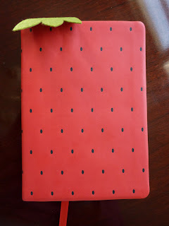
This cute little book has a great feeling, soft cover. I'll be giving this away to a lucky reader!
So here is how the giveaways will work: Unfortunately due to mailing restrictions where I live, I can only send to people in the US, via USPS (which means no P.O. boxes). I'm very sorry to all of you outside-the-US people. I would send to you if I could. When I post the review for each giveaway book, if you want to be entered in the giveaway contest, post a comment. I will give a few days for people to post comments, and then I will choose the winner by random number generation. You can enter only once per book, but you can enter the giveaway for each book if you want.
Below are the books that I won't be giving away, but I will still do separate reviews for each to show the quality and range of style of the other Daycraft books.
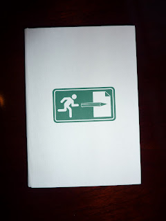
The white book is a lined notebook, with the person heading for the exit on the front and on the back in green is printed "Let your creativity escape here." It is part of the cleverly tongue-in-cheek D-sign series of notebooks. At 6 inches tall by 4 1/4 inches wide it is small enough to go everywhere, and has a ribbon page marker. My sister and I are currently fighting over this one! Sorry, this one will not be part of the giveaway, but I will still do a thorough, separate review of it.
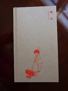
The last book in the top row is the Cantoon notebook, a play on words of Cantonese and cartoon. The cover has "a Cantonese mnemonic for learning English" which makes me wish I knew Cantonese!This notebook has a cool, old-school look and is quad-ruled on the inside. It is 7 inches tall by 4 inches wide. Sorry, my sister and I are fighting over this one too, but it will still get its own separate review.
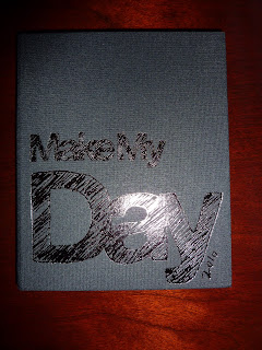
Left side bottom row: the Make My Day diary. I am keeping this one because I absolutely love it and it does, in fact, make my day. The hard cover has black fabric that feels nice to touch.It's a very portable size (6 1/4 inches tall by 5 1/4 inches wide), but the almost-square shape means the weekly spread (with the days as columns) has plenty of room to write. I will do a thorough review of this one, it has tons of great features.
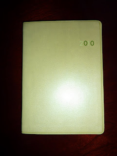
The next book on the bottom is the green Chromatic Days diary (which also comes in several other colors). It has a very nice, soft cover and a week per page. It is very portable at 5 3/4 inches by 4 1/4 inches, and very slim. My sister is getting this one (if she's lucky, because I really want to keep it!) but I will still give it a thorough review. It is an excellent diary with the weekly and also monthly views.
Next on the bottom row is the pink Signature sketchbook. It. Is. Beautiful. The cover is soft to touch and flexible, the pages are cream and blank, the page edges are black, and it has a ribbon page marker. I'm keeping it, because I love it and I absolutely cannot bear to part with it. I will have to think of a noble purpose for this one because it is really special. It is 5 3/4 inches by 4 1/4 inches, so it will fit in any small bag. The Signature line also includes notebooks and diaries in a variety of sizes and colors, weekly or daily format. This is a gorgeous book.
These are just a few of the styles of diaries and notebooks available from Daycraft. Also check out their super-cool Decoder sketchbooks, Laptop notebooks, Feminique notebooks (oh how I want the lavender one!!), and tons of other diaries and notebooks.
More info to come in the reviews! Stay tuned!
Friday, January 22, 2010
Exacompta Journal 21
Here is my review of the Exacompta Journal 21 (with the beautiful lilac Club cover that I love so much) which was so generously sent to me by Karen at Exaclair in New York. Thank you again Karen!
The Exacompta Journal 21 is a large (5 1/4 by 8 1/4 inches) day per page planner that is refillable with a removable cover.
According to the paper label band that comes on the book, "Exacompta is the Prestige edition of Quo Vadis." The Journal 21 lives up to that Prestige name in every way. The book is elegant, well-made, and shows fine attention to details. According to the Exacompta website, "Elegant and intelligent, Exacompta products follow a French philosophy that even simple tools should be good quality and a pleasure to use." I heartily agree!
The paper band also says the book is made in the USA, which I really appreciate. Thank you for supporting American workers, Exaclair!
I have used many, many different brands of day-per-page planners over the years. (To see just a few of the daily books I have used in the past, scroll down and click "day per page" under Labels in the sidebar.) So I have a good idea of what works in a daily planner, what features are nice, and what is a daily planner fail.
A big problem I've had with most day per page books I've used in the past is that I get "lost in a sea of individual days" as I call it. Without the visual indicator of a weekly layout, I forget where I am in the week, fail to look at what is coming up, and even frequently forget what day it is. Seeing only a two-day spread in front of me allows me to focus on today, but often at the expense of planning ahead for later in the week or month.
The Journal 21 has completely solved this problem with some very clever and extremely useful features to help you keep track of where today is in the context of the rest of the month and year.
On the daily pages, there are calendars for this month and next month, with the current week highlighted. This makes it easy to see where today is in the month and week. Also on the daily page is printed the number of the current week, and where today ranks in the year. Another wonderfully useful feature is that the months are highlighted as tabs along the side of the page, so when you are flipping forward or back in your book, it's much easier to find the month and subsequently the day you're looking for. (I love the monthly tabs!)
Also in the above photo you can see that holidays are printed at the top of the page without taking up too much space for writing the day's priorities or major events. The day and date are printed in large type right at the top of the page, again making it easy to find the date you're looking for.
Perhaps the most glorious feature of the Journal 21 is that it has monthly calendars, with spaces large enough to write in. This makes the book infinitely more valuable than just a regular day-per-page book. This makes it possible to use for forward-planning and monthly overviews of deadlines, things due, or upcoming events.
In addition to the monthly calendars, there are semi-annual calendars with the months as columns, for longer-ranging overviews of upcoming travel, holidays, reports due, long-term projects, etc.
There is also an annual planner for next year, for farther future planning.
I thought this was interesting: there is a notes page holding the spot that February 29 falls on during leap years, thus keeping the exact same number of pages in the book each year. This not only ensures that refills will fit into the covers year after year, but also probably helps keep production costs down to have the standard bound book with the same number of pages each year. They've thought of everything!
Another important feature is that the book lays open by itself (despite me holding it flatter in the above photo). This is extremely important, because as my sister says, "A closed planner is a dead planner." Especially for a day per page book, which I need to have open in front of me all day for maximum visibility. Staying open by itself to today's page is of utmost importance! The Journal 21 does it easily.
The paper: The paper is wonderful to write on, very thick and smooth. But, personal preference here, I don't care for the green tint. The slight greenish tint is designed to be glare-free and easy on the eyes, and recalls the early days of the Exacompta brand when they made ledgers with the same "Registre Azur" tinted paper to make it easy to look at during the long hours of entering numbers by hand. I personally don't find it to be very friendly-looking. I consider my planner to be my constant daily companion, and I look at it all day every day, so I want it to be friendly-looking. I prefer the ivory colored paper of the Exacompta Daily Pocket, shown compared to the Journal 21 paper below. The ivory paper is warm and inviting. So anyway, I don't care for the green tinted paper, I would prefer ivory or white. Just my personal preference.
**Edited later to add: You know what, despite all that, after using it awhile I discovered the slight greenish tint really is soothing to look at. So, I take it back! Yes I would still prefer white paper, which I always do, but the greenish paper really is nice.
(As a side note, the Exacompta Daily Pocket has many of the same features as the Journal 21 including the monthly calendars and semi-annual planner, so if you like what you're reading about the Journal 21 but need a smaller book, the Daily Pocket's the one for you.)
Whatever your preference about the color, there is no arguing that the paper is joyful to write on. Smooth and thick, it's nice to touch and takes ink extremely well. I tested a variety of pens, most of which were liquid ink pens, of various point thickness and all did extremely well. Even the thickest (the Broadpen) had absolutely no feathering or bleed-through to the other side of the page.
The only other complaint I have is a common one: there really needs to be a ribbon bookmark (or preferably two, one for the daily section and one for the monthly). I don't mind tear-off corners for weekly planners, but I am very, very opposed to them in thicker daily books. Day per page books are very classy-looking, especially this one. But when the corners are torn out of the book, that gappy, flappy corner looks sloppy, which is unfortunate. I still haven't decided how I will mark my pages in the Journal 21 without tearing out the corners. I tried using a bookmark but it slides out of the smooth pages. I think I will glue a ribbon page marker to the inside of the spine of the book and use that.
I love that there is a variety of cover style and color choices, adding to the personalization and overall enjoyment of using the book.
I highly recommend the Journal 21 for anyone who wants a larger but still portable day per page planner that is loaded with features that let you focus on each day and also do longer-range planning. It's a good-looking, elegant book that is a pleasure to use, and is also a very powerful planner! Well done Exacompta!
Wednesday, January 20, 2010
Secrets for Success
While I was in Scotland I read this excellent article by John von Radowitz in The Scotsman newspaper. In the article, Radowitz details what techniques do and don't work to help us reach our goals.
Psychologist Richard Wiseman (fitting name!) of the University of Hertfordshire studied 700 volunteers and compared techniques used by those who were successful or unsuccessful in achieving their goals. People who were unsuccessful used techniques that are commonly touted as being useful for helping people achieve their goals such as relying on willpower, fantasizing about being successful, and adopting role models. They also "tended to dwell on the bad things that would happen if they did not achieve their goal."
Professor Wiseman said, "Many of these ideas are frequently recommended by self-help experts but our results suggest that they simply don't work. Because of the widespread nature of this advice, millions of people will fail to achieve their aims."
Wow. So much for self-help books. No wonder people have to keep buying them!
So what does work? Here are some techniques Professor Wiseman has found in his study that are effective at helping people reach their goals:
1) Breaking goals down into small steps, then rewarding themselves when each stage has passed.
2) Telling friends about what they were trying to achieve.
3) Reminding themselves of the benefits of obtaining their goal.
4) Charting their progress.
Being a planner geek, the first thing I thought of was ways to use planners in this way to achieve goals.
There are a variety of planner styles and brands that would be very helpful in the above steps. Filofax and Uncalendar especially come to mind, because both of them have (or can be customized to have) the capacity for listing goals, breaking them down into weekly and daily tasks, and charting progress.
Filofax has accessories like tabbed dividers for giving your book designated sections for your goals. You can have an Exercise section. Or a section for a specific project you are working on. Or you can have an entire Filofax devoted to a specific purpose. There are also paper inserts that are perfect for charting progress such as quad-ruled pages, blank pages, lined, various colors etc. There are many ways to customize your book to fit your needs.
Uncalendar is engineered to help you set and achieve goals. This is where Uncalendar excels and stands out from the rest of the planner crowd. In the Goals section, you can set your goals and break them down into tasks. There are spaces on the weekly pages to write reminders of the benefits of achieving your goals. The book has motivational suggestions like rewarding yourself for reaching your benchmarks.
But #4, Charting Your Progress, is where Uncalendar really shines. There are many places throughout the book to chart and record your progress toward your goals. The weekly worksheet has a grid on which to record or chart data for the week (such as financial totals, daily weight or blood pressure measurements, miles run, inches lost, sales, whatever). In the Notes section there are plenty of graphs for more charting. In the Data section in the back of the book there are more graphs and tables for recording monthly totals or to chart progress. One grid that I especially like has 52 rows (for weekly records) and 12 columns (to record monthly totals).
Your planner can be a very useful tool for managing not only your appointments, but your entire life. How do you use your planner to help you reach your goals?
Monday, January 18, 2010
I’ll Give It a Tri, Or “Why I divorced my Moleskine”
Here is another awesome guest post from my sister Sandy, where she reviews her Quo Vadis Trinote planner:
Ever since my sister introduced me to the world of the Moleskine week + notes weekly planner, I have used it religiously and faithfully. That is, until 2 years later, when she revealed the various styles of planners offered by Quo Vadis. Back when I was in my first semester of college, I used a Quo Vadis Daily Text Agenda. But now, in this stage of my life, there is a lot more to plan than when I’m going to meet with the study group and what outfit I’m wearing to this weekend’s party. I need some SERIOUS planning capabilities. Karen at Exaclair was EXTREMELY generous and allowed me to sample the Quo Vadis Trinote Agenda Planning Diary. I’ve been using it for a month now, and I can honestly say that I’ve shelved my Moleskine. (Enter gasp here)
I was afraid that the Trinote would be too large for me, since I can’t carry it in my purse. But, so far that hasn’t caused a huge problem. I do like the bigger size, so that I can put papers inside without the edges of my papers getting messed up. I can even paperclip a bill and its corresponding envelope on the weekly spread that it’s due. I wish there was some sort of elastic band or snap closure, so that my papers wouldn’t fall out when I have a clumsy moment. But, it works when I’m having a good day. So, yes, size matters, but function matters even more.
I.LOVE.THE.FORMAT. “Holy Vertical Columns, Batman!” I didn’t think my life was busy enough to justify using weekly columns, but it turns out that it is. AND, it turns out that this is the most visually efficient format for me and my visually stimulated mind. This format actually makes me recall meetings that I would’ve otherwise completely forgotten, because I remember that I wrote something in a certain space on the page. I don’t remember what I wrote, but I remember seeing something around 3pm on Wednesday. So, I check, and sure enough – there it is! An appointment I nearly forgot about popped into my head, because of the format design. And if I don't get something done on the day it's written, I can just draw an arrow over to the next day's column to remember to do it tomorrow.
The Notes spaces at the bottom of the daily columns are good for recording my daily expenses (in red, of course) and whatever other notes I have that day.
Lists on the right are organized well, although I don’t use the fax/email one often, so I need to think of something new for that. The pay-receive list is the best ever, because I can write what bills are due and figure out which ones I pay with this check and which ones can wait until next payday. I can visually see (here we go again) what’s coming up.
The top has clearly marked the days of the week and dates, along with a Priority line and extra space below it to help me remember what bills are due, when my son’s school is closed, when I need to submit an expense report, or when it’s my niece’s birthday…. events specific to that day that need to stay on the top of my mind.
Love the quarterly monthly view calendars on the right and the from-to dates of the current week (for example “December 14th – December 20th” in the photo above), so that I know which week it is and I can quickly flip through to get to the date I’m looking for.
Paper is fabulous. Who doesn’t know about the fabulousness of Quo Vadis paper yet?!
Sunday is smaller but an efficient use of space, because I have fewer appointments (maybe a baptism or a birthday party to attend) & the notes space for Sunday is big enough to write details for the party or just a to-do list for the day (clean house, wrap presents, buy groceries).
I love, love, love the removable address book, because I’ve made it a reference book instead of an address book. Under “C” I have all the information about my car… when I got my oil changed, when I got my tires rotated, the insurance company’s contact info, my loan number, etc. Under “A” I have the addresses and dates for every place I’ve ever lived and when I lived there. Under “M” I have “Medical Directory,” which lists the phone number for the pharmacy, the doctor, and contact info for my health insurance, eye insurance, dentist, and dermatologist. How awesome is it to flip to ONE page and have all that right there?
Can’t decide how to use the Anno planning 2010 spread, because it is so precious (my preciousssss) that I’m afraid to tarnish it. Any suggestions?
There is only one Notes page and, like the anno planner, it's too precious to tarnish. What good is a planner if you don’t use it though?
The Receipts/Payments section could be my budget section for the year, but I hate budgeting, and using this section would be stressful, not fun. What other monthly reoccurring items can I record? There are enough blanks to record something for every day of the month… the weather? My mood? The possibilities are endless!!! Wait, there are enough spaces to record the weather on one side and my mood on the next.
The maps are beautiful!
2011 anno planning section for future planning. Excellent for upcoming doctor’s appointments made at the end of 2010 for 2011.
It’s extremely handy that the holidays are listed at the top of each corresponding day’s column. I also appreciate knowing the moon’s cycle, which can also be found at the top of the corresponding day’s column as well. It helped me plan to STAY HOME on New Year’s Eve, when it was not only “Amateur Night” at the bars (aka “So You Think You Can Drink?), but also a full moon, meaning that the city was soaking and seeping with drunken crazies. I’ll be sure to keep an eye out for the similar thing on Saturday night, January 30. If I worked for the police department, this would be a helpful tool, so that I would know in advance that is was going to be a “busy night.”
Biggest dilemma: What pen should I use? The pens I like to use tend to smear on the paper, because it’s kind of glossy. But, I don’t like my handwriting when I use a ball-point, and I like to use lots of colors to indicate various categories: finances, meetings, deadlines, and my son’s activities.
Overall, the TriNote meets all my needs, except that I wish it had an elastic closure. I’m working on creating a hack for that, though. Also, the size is great for having enough space for planning, but since I can’t carry it in my purse, I tend to leave it places & lose it for short periods of time. This is unacceptable. I will have to adjust my lifestyle, or what size purse I carry, to incorporate the Trinote into my life, but in the end, I know it will be worth it.
In summary: “I do so like green eggs and ham! Thank you! Thank you, Sam-I-am!”
Thursday, January 14, 2010
When is a planner not a planner?
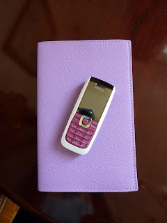
I am getting to know my new Journal 21, which was very generously sent to me by Karen at Exaclair (many thanks Karen!) and which I will be posting a review of here on Plannerisms in the near future. Above is a photo of it, in its gorgeous lilac Club cover, with my phone just for fun. Don't they look great together?
Every year I use a day-per-page diary in addition to my weekly planner for a variety of uses: overflow on those really busy days when I have a lot going on; as a "brain dump" when I have so many things swirling around in my head that I need to get them all down on paper; as a landing place for jotting phone messages, notes and ideas that would otherwise get written on some random piece of paper and promptly lost. When I write these things onto a dated page in a bound book, they are so much easier for me to find again later.
A dated day-per-page book can have so many more uses beyond the usual scheduling appointments and listing to-dos. Here are some alternate uses I thought of:
- daily journal
- gratitude journal
- dreams journal
- recording cute things your kids did/ said (I do this, and it's so much fun to look back and remember)
- noting daily weather (I do this in my daily journal)
- phone log/ messages record
- lesson planning
- medications record
- exercise/ training regimen record
- food diary
- menu planning
- ideas record (interesting to see how they develop over time)
- blog ideas (guess where I wrote the draft for this post? My Journal 21!)
- garden planner/record
- daily record of expenses/ budgeting tool
- sales record
- tracking finances and/or investments
- record of communications with clients
- work record (DianeB's excellent idea)
- meeting notes
- quotes/ motivational statements
- sketch of the day
Sunday, January 10, 2010
I'm back!
Hi everybody, I'm back from my wonderful vacation in snowy Scotland! I have to admit I'm very grumpy to be back in Albania and definitely have the post-vacation blues. And, I'm also feeling a bit overwhelmed at everything I have to do in 2010. It will be a very busy year for me, and my planners will all have smoke coming out of them by December! I'll be writing plenty about all of that in future posts.
Lots of things happened while I was away!! The 6th Carnival of Pen, Pencil and Paper hosted by Journaling Arts features my Ghost of Planners Past #1: Desperation post, as well as a whole bunch of very cool articles and reviews from numerous authors. As soon as I'm done unpacking and doing laundry, I plan to peruse them thoroughly.
Another thing that happened while I was gone is that Kanalt, a Philofaxy reader, has started her own blog: Life Well Planned. She has a guest post this week on Philofaxy about a favorite topic of mine (maps!). My friends tend to make fun of me that I'm never without a map, so her post was especially interesting to me.
I've noticed there are several new readers and commenters here on Plannerisms, welcome! I love reading your comments. I especially love to read about what planner format(s) you are using, how you use them, and how your use changes and develops over time, so feel free to comment any time.
I have lots of things coming up soon here on Plannerisms. In a few days I will feature another guest post from my sister Sandy, where she reviews the Quo Vadis Trinote planner she received from Karen at Exaclair in New York. Sandy has been a very devoted user of the Moleskine large weekly notebook for a couple of years now, so the Trinote was really put to the test, with shocking results. Stay tuned!
I will also have some new posts over on Philofaxy, so be sure to keep up over there too!
I hope the first weeks of 2010 are treating you well. I want to hear from you, especially those of you who are using a new planner format this year. As the days and weeks go by, let us all know how your planner is working for you!
Friday, January 8, 2010
Toh-may-toh, toh-mah-toh
The Moleskine US website says it's pronounced "mol-a-skeen'-a" but I don't think I've ever heard it pronounced exactly that way. I've heard "mol-skin," and "mol-skeen," among other pronunciations.
For some reason I pronounce it "moh-leh-skeen'-ay," just because I like to. When I refer to "my Mole" I pronounce it my "moh'-lay."
What do you call it?
Thursday, January 7, 2010
Letts A6 Principal daily diary
Here is a rundown of the content: The first page is personal information, the next page is Notable Dates for 2010 and 2011, the next 2 page spread has calendars for 2010 and 2011 (with the days just as numbers, no writing space) and then starts the day per page section. At the back there are a few pages for addresses and notes. That's it. No maps, no international information, and most disappointingly, no monthly planning of any kind (whether months as columns or month per page).
Despite the spartan content, this diary has some finishing touches that make it a really nice book. It has a hard cover which gives it an elegant book look and feel. The color choices are blue, gray, red and lilac, which of course was my choice (this photo looks more blue than the actual color). I chose to have my initials imprinted on the cover, which is a really nice touch. The cover also has Letts 2010 imprinted in the top corner, and on the spine. But unfortunately, the product code (P1W) is also imprinted on the spine and back cover, which is not attractive at all.
The book has a ribbon page marker, which is infinitely preferable over tear-off corners for a day per page book. This (4 1/4 x6 inches) is an excellent size for a daily book. Small enough to carry around everywhere, but the pages are still large enough for plenty of writing. It's not large enough to use as a journal, for me at least, but as a basic planner or reminders book it's a good size.
The paper is fine, nothing to write home about. There is a little bit of show-through to the other side but it's not terrible. The paper does not have the silky-smooth feel that you could expect from a Moleskine, Quo Vadis or Exacompta brand planner. I can't quite figure out what color the text and lines are: brown? plum? Whatever it is, it's a good color because whether you use black or blue (or any other color) ink the writing stands out. One reason I bought this planner is because the daily pages have all of the holidays for the UK and US (and also Canada and Australia), which I really like having on my planner pages.
In all it's a good little diary/ daily planner. For someone who lives in the UK, it's a good price at less than 7 pounds. But I got the personalization, and paid for international shipping, which together wound up to be about the same cost as the price of the book. To me it was worth it because I wanted to get this book last year but by the time I got around to ordering it, they were sold out. I like this size as a carry-everywhere book. And, I'll admit, I'm a sucker for personalization so that was a big selling point. And hey, it's purple! How could I resist?