Just because I'm in love with my Quo Vadis Minister doesn't mean the Moleskine 18 month weekly notebook is a bad planner. Actually, it's an excellent planner.
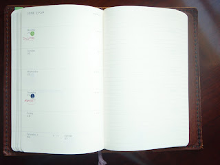
Here is a photo of the inside (which you can click on to get a better view), just in case you haven't seen one of these yet. The Moleskine layout is very clean and simple, yet there are features that show the high attention to detail. For example, I'm not sure you can see this from my slightly washed-out photo (you can in the enlarged view when you click on it), but the lines that mark the borders of the daily spaces continue straight across the page and merge seamlessly with the lines on the opposite notes page. This not only makes the page spread look great, it's also very useful if you need to continue your schedule or tasks straight over onto the notes page. Lines out of alignment would have looked jarring. It's little things like this that make a Moleskine especially pleasant to use and look at.
The top of the weekly schedule page has a large space for writing whatever you want. Personally I resented this space because I would have rather had more space for the weekends (which have very tiny spaces for Saturday and Sunday), but I know people like this space for making notes or highlighting the week's priorities or goals.
The unobtrusive lines and minimalist typeface contribute to the streamlined appearance. Holidays are not written on the page, but initials of the country having a holiday are noted on the day's space, in the corner where it won't interfere with your writing.
The mostly-blank pages allow for customization and creativity. There is nothing constraining in any way, and even the lines can be written over easily. This is a great planner for people who need open space for their days without time constraints or lines. But people (such as myself) who crave more structure can do that too. As you can see I wrote in the beginning and end dates of the week next to the month, to make it easier to find the correct date while flipping through my book. Also you can see the Filofax stickers I used to indicate important dates. (More on these stickers in a later post!)
The layout of the week on the left page and a lined page on the right works well for a lot of people in various situations. I think this would have been great while I was in school, when I didn't have many scheduled events on any particular day but did have lots of to-dos and assignments to keep track of.
This planner worked fairly well for me when I didn't have too much that I needed to write in any particular day. But when my days were very busy, I found there was just not enough room to write (especially on those tiny weekend days!). I did enjoy having an entire blank page each week, and could use it differently every week if I wanted to. Some weeks the page was full of tasks. Sometimes I had phone numbers, notes, directions, party guest lists, websites and books to check out, or whatever other random thing I needed to write down. It was nice to have a place to capture all of those jottings that might otherwise get lost. I think this is the biggest appeal of the weekly notebook format.
The usual Moleskine features apply: nice paper, sturdy binding, hard cover, elastic strap, back pocket. The corners are rounded and the book is very pleasant to use and hold. The black hard cover planners come with a removable address book, which I find very useful. The front pages include tons of international information (which I appreciate and refer to often). There is a very lame map of international time zones that is not detailed enough to be very helpful. The 18 month planner also has pages to write your class schedules for each semester. I have transformed these into charts to track my financial totals since I don't have a set weekly schedule.
Besides the main weekly notebook there are other calendar formats too: monthly views of the second half of 2009, all of 2010 and 2011 with the days as numbers. Also there are calendars with the months as columns with a line to write each day, 2 months per page, for July-December 2009, all of 2010, AND ALL of 2011. I do a lot of long-range planning so I REALLY appreciated this. Bravo Mole!!
My Mole is the large size. In the past I have used the pocket size, and it is tiny. It really would fit into a pocket, and would be a good choice for a satellite book to a larger desk planner, or for someone who doesn't need much writing space. I chose the 18 month planner because I wanted the weekly notebook with a black hard cover. The 12 month weekly notebook only has a hard cover in red (which I loooooathe. I hate that screaming red! But I must be in the minority because I know it's very popular.), or soft cover in black. So to get the black hard cover I had to go for the 18 month book. Which, interestingly, costs just about the same as the red hard cover 12 month book.

The 18 month book is great obviously for those on an academic schedule, or anybody who needs to start their planner anytime between the beginning of July and end of December.
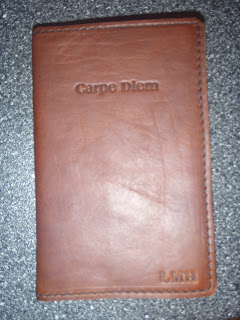
I had this custom leather cover made for my Mole by Renaissance Art, and they did a great job. They tweaked it for the thickness of the 18 month book, and did the customization exactly how I wanted. The 18 month weekly is the same thickness as the Moleskine sketch book, so I will continue to use this cover on Mole sketchbooks, because the cover is too awesome not to use!
So there you have it, just in case you thought I was dissing the Mole. There's a lot to love about the Moleskine weekly notebook. If you want a planner without constraints and need the flexibility of a notes page every week, then this one is definitely worth checking out!
And I forgot to add: I first noticed this planner a couple of years ago when my sister was looking for a new format. I thought this would work for her so I suggested it. She got one and liked it so much that she suggested I get one. I'm glad I did!
ReplyDeleteSo, thanks Sis!