Happy Hogmanay everybody!! I'll be ringing in the New Year in the Highlands of Scotland, where they really know how to do a New Year's celebration.
I hope you have a great New Year's Eve!
Thursday, December 31, 2009
Monday, December 28, 2009
Letts Scotland Diary
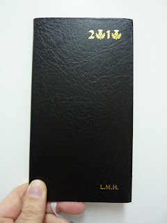
This is the Letts 2010 Scotland Diary, which is a weekly (week + notes) format. This little planner is packed to the gills with Scotland facts and information and would make a great gift for anyone who lives in, travels to, or has any interest in Scotland.
First of all, I love the cover with the thistle design in place of the zeros in the year. Inside the covers are full-color photos of Scottish castles and landmarks. Inside the book there are several pages full of Scotland information: events for 2010, historical facts, famous Scots, and then an astonishing number of websites, phone numbers and contact information for every type of service or interesting place in Scotland's major cities. There's information for travelers, mileage charts, and visitors' attractions.
The Scotland information doesn't stop there. In the weekly section, every single day has a Scottish date of note. Every. Single. Day! The birth dates of famous Scottish people, dates of historical events, anniversaries and other dates of note. It's really remarkable.
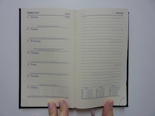
The planner itself is very small and slim, and the week + notes format would be useful for someone who doesn't have many appointments. I bought it just for the Scotland information. I really, really wanted one for Homecoming year 2009, but by the time I got around to ordering one last year they were, tragically, completely sold out. I didn't want to have the same problem again this year so I pre-ordered it this past summer and happily received it in the fall. The personalization with my initials on the cover is a nice touch too.
I'm really happy to have this little planner, more for the information it contains than for planning. I'm bringing it with me on my trip to Scotland as a reference book, and undoubtedly it will be helpful during my time there.
It's a clever idea for a specialty diary, and another great diary by Letts.
Labels:
Letts,
Scotland,
week + notes,
weekly
Friday, December 25, 2009
Wednesday, December 23, 2009
My journal (which is actually a planner)
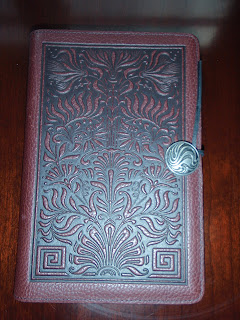 For many years I used standard blank or lined-page books as my journals. Now I tend to not even read those old journals because, to be honest, I often went on and on for too many pages about stuff that I could have written on one page. Also, I frequently had a problem using those books because if I didn't write in my journal for a few days or weeks for whatever reason, it created a roadblock. I couldn't write about subsequent days until I had taken the time to fill in all the past days, or else I would have to skip those days entirely. (Or, the horror, write out of chronology!)
 For the past 2 years I've been doing something different than in previous years that I am liking much better: I'm using a large Moleskine day per page diary (which I put into my awesome leather Oberon Design cover that my husband got me) as a journal, and this has worked well for me for several reasons:
1) Having only one page per day forces me to be succinct and not blather on. I tend to write more about what I and my family did rather than pontificate endlessly.
2) It also encourages me to write SOMETHING each day, or at least most days. I like to have a record of what I did and I hate having blank days.
3) Probably the most useful aspect of having a dated day per page is that I can go back later and fill in days I didn't have time to write about at the time. (What do I use as a reference when I am back-filling my journal? My planner. Which is a completely separate book from my journal.)
There are certain features of the Moleskine daily diary that make it very useful to me as a journal. Incidentally, some of these features also make it less useful to me as a planner. One of these is the lack of monthly calendars on the daily page. When I can't see where today is in relation to the rest of the month, I can't plan ahead. But for a journal it doesn't matter. I really like the weather and temperature icons at the bottom of each daily page, because I do like to record what the weather was that day and look back at it later. This feature is especially fun now to see what the weather and temperatures were on corresponding days in Moscow (2008) vs. Albania (2009).
But ultimately what makes the daily Moleskine my choice of planner to use as a journal is that the pages look like the pages of a notebook, they just happen to have the date at the top. The subtle lines are the right width, and the space at the top of the page for important events of the day looks just like the top of a regular piece of notebook paper. I guess this is the appeal of a Moleskine: a blank slate for you to fill how you see fit.
For planning, I need lots of structure. For a journal, I still need that daily prompting but other than that I like the blank slate.
Monday, December 21, 2009
Solstice celebration!!
Today is the shortest day of the year for those of us in the northern hemisphere. I'll be spending it in the far north, where the day is shorter than in some other places.
I like to celebrate the solstices and equinoxes, just to mark the natural cycles of the year and recognize the seasons. Usually our celebrations involve fire and meat on a stick, accompanied by plenty of libations.
My Minister planner has the solstices and equinoxes pre-printed onto the days, which is great because normally I have to write these in every year.
Do you celebrate or otherwise recognize the solstices and equinoxes? Are there holidays or celebrations that you usually have to write into your planner yourself because they are not pre-printed?
Happy Solstice everybody!
Labels:
Minister
Sunday, December 20, 2009
Ghost of Planners Past #4: The one that started it all
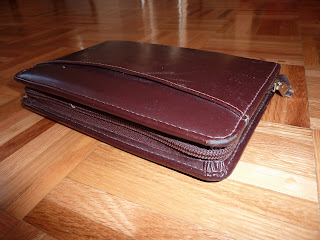
Here is my old Cambridge planner, the one that started me on my journey to Planner Nirvana.
Before I used this one I used whatever weekly planner had the prettiest pictures, usually Sierra Club or something like that. But one summer a co-worker of mine showed me her Cambridge planner and the rest is history.
I had never really seen such a book and was fascinated. I asked her what she kept in there and her enthusiastic reply was, "Oh EVERYTHING! My whole life!" She generously allowed me to flip through her book and I couldn't believe my eyes. She indeed had everything in there: her calendar, addresses, lists, notes, and anything else she might possibly need in her life. She said, "And you can be really mean to it and it's fine." As an example, she zipped it closed and banged it on the counter. Sure enough, no papers flew out, the book remained intact. It obviously would hold up to rattling around in a bag or being thrown around in any circumstance. I had to have one.
I ran out and bought the binder and a bunch of refills, including an awesome calculator that fits on the rings that I still use to this day. I decked it out with address pages, a calendar, notes pages, tabbed dividers, business card holders, the works. Instantly I saw the appeal of such a book.
I live a pretty nomadic life, and this type of a ring-binder book is very useful when traveling and moving frequently. My friend and I were both about to move to Hawaii (although to different islands), and she showed me how to photocopy a map out of a book, size it appropriately, and put it onto the rings of my book (a technique I have used ever since).
Of course having all of my addresses in one book is very important, and being able to add pages was revolutionary. The zip closure held everything securely and had a satisfying sound as it enclosed each of the three open sides: "Zip! Zip! Zip!" The book even has an exterior pocket for tucking in random papers.
I used this book for several years. This is the planner I took with me to Nepal. I remember buying several packs of blank monthly calendar refills for it. As I wrote in the dates for the following two years with a mixture of excitement and trepidation, I wondered what I would write in those daily spaces. I had no idea what lay ahead of me.
Now the book is like a time capsule of that time of my life. I still have a photo of my sister as she was moving into her college dorm room tucked inside the book. It contains the addresses of my friends at the time and people I met along the way. The exterior is a little scuffed and the zip isn't as smooth as it once was. But I'm grateful to this little book, not only for keeping my life together for so many years, but also for initiating me into the world of planners. Thanks Cambridge!
Labels:
Cambridge,
Ghost,
Using planners
Friday, December 18, 2009
Papergeist planners and notebooks
Recycled paper planners and notebooks seem to be very popular right now, which is great. I'm all for not cutting down trees to feed my book habit. But even recycled paper has to go through some amount of processing, and no matter how ecological it is, it uses resources like electricity and water to process.
Papergeist has gone that much further past recycled paper, to re-using paper and covers without processing them. They call it "post post consumer." Their covers are made from, get ready: vintage record covers from second hand stores or even rescued from the curb. The reclaimed office paper is "french folded" so that the printed side is not visible, and even marker won't show through to the other side of the page. They'll even buy back the coil from your book when you are finished with it to use in your next book and give you $5 off.
The books come in a variety of formats: blank, lined (journal), To Do list, or (yay!!) weekly appointments (planners!). The planner (shown above) has the days of the week printed, but no dates so you can start it anytime or use it only on weeks when you need it. I think this is very clever, and the most ecologically sound you can get for a planner. You don't have to start the planner on January 1 or July 1 or whenever the printed days begin to use every page. You date it, so you start it when you want.
The covers are absolutely unique. You can browse their current selection (their store is in real time) and choose your cover, then specify how you want the interior pages. They spiral bind it all into a book and there you have your very own, completely customized, fully re-used, absolutely unique book. You can be sure that nobody else will have the same book!
I think this is a really cool idea! I love customization, and the vintage covers look very retro-cool. Their low ecological impact is very admirable, and I'm glad to see a company that is so forward-thinking. Especially these days when climate and ecological impact seems to be on everyone's mind!
Labels:
Papergeist,
recycled,
undated,
weekly
Thursday, December 17, 2009
Off to Scotland!!

Hey everybody, I'm leaving today for 3 1/2 weeks in Scotland! I have several posts scheduled to auto-post while I'm gone, and I'll also pop in every now and then whenever I have internet access.
I hope you all have a great holiday and very Happy New Year!! All the best to you in 2010.
Happy planning,
Laurie!
Calling all planners! Reader needs help!!!
Jamie is a Plannerisms reader with a big problem: his planner that works so well for him has been...brace yourselves...discontinued!!! To me, this would be terrible. Once I find something that I really like and that works so well for me, I get really upset if it's no longer available!
I'm hoping you readers will be able to help Jamie out. I'm not familiar with the brand of planner he uses (Burde) so I wasn't able to give him suggestions for a direct equivalent. He uses a spiral bound day per page planner, and the only one I know of is the Quo Vadis Textagenda, but of course that's on the academic year which is half over by now.
Here is Jamie's email to me. If you are familiar with Burde planners and can recommend an equivalent, or have any suggestions for him, please post them in the comments! Thanks everybody!!
Hello,
I am a fellow planner lover and I'm in quite a pickle. I am in love with my current planner - a Burde, spiral bound, heavy-duty cloth covered cover, one day per page, dated, untimed, removable corners, and plenty of space to write. My problem is that this planner has fallen off the face of the earth for 2010! To some, I may sound ridicilous but I think you'll understand when I say, I am so upset! I have searched high and low for a suitable replacement for this planner which ends in about 15 days and nothing is even comparable. I found your blog when I was doing my daily search for a new planner and wanted to know if you knew of anything that might help me out?? I would appreciate any help that you are willing to offer. Thanks so much !
Happy Holidays,
Jamie
Labels:
day per page
Wednesday, December 16, 2009
Sandy's FiloFAIL, Mole Love, and Trinote Try
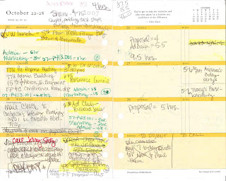
Here's another guest post from my sister Sandy, chronicling her planner journey...
As you might have figured out, I’m Laurie’s younger sister. And, I have a confession: I’ve always looked up to her. What she thought was cool, I instantly thought was cool. And, one day, she showed me her Filofax. It was so awesome! It was a black Personal size with a beautiful leather cover. I was completely enthralled with the concept of a binder style planner. I LOVED her tabs and all the information she could load into them, in such an organized way. I quickly imitated her planner by purchasing my own Filofax and immediately filled it with tabs: Goals, To Do’s, medical information, ideas and designs for how I was going to decorate my son’s bedroom after he was born, and other various reference materials. I also purchased a Franklin Covey planner at Walgreens strictly for removing other reference pages that would fit into my Filo, such as “Meeting Planner,” “Goal Setting,” “Contact Log” (for new clients/leads/potential sales clients, etc.). Oh yeah… there was also a weekly 2-page spread planner in there. Ha! (it is a PLANNER after all.)
I wanted the pages to be “pretty,” so I purchased a Franklin Covey weekly inserts package that came in a variety of pastels with cute quotes on some of the pages. The planning pages were fairly simple and clean/not cluttered. Monday – Thursday were on the left and Friday through Sunday were on the right, with a “notes” box under Sunday that was equal in size to the daily spaces. Each day was split in half. On the left, there was a box for appointments, and then a double (vertical) line separated that box from a smaller box for “To Dos,” but the box was violated with the holes that held the pages into the binder. So, I pretty much wrote at an angle on those pages to squeeze it all in. I also tried to track my time for which projects I worked on throughout the day, so that I could fill out my timesheet correctly. Overall, the pages were full, and each day turned into a chaotic mess of appointments, completely ignoring the To Do list box to fill in all the scheduled meetings. Also, random information was everywhere and in sporadic places. Click on the above photo for a great view of the hot mess of my weekly pages!
Why was this a Filo Fail? Let me count the ways:
The damn thing was a BRICK. With all that information in all those tabs, it must have weighed a good 3 lbs. Ladies, can you feel me that every pound counts in your purse? It was so fat and wide that I could barely hold it in my hand without getting a cramp! I liked that it stayed open and laid flat on my desk, but the heaviness made it awkward to transport. Also, I am very much an “out of sight, out of mind” person. So, all that information behind my tabs? Yeah, I completely forgot about them.
As my sister might have told you, I once carried a Quo Vadis daily Textagenda during my Freshman year of college. I loved having all the space to record random thoughts, notes, and details for assignments. But, again, out of sight out of mind. Come Tuesday, I would open up the page, only to find that I had a quiz that morning! I had that tingly hot feeling throughout my body… like when you’re almost in a car accident… when I realized that I had completely forgotten to study. I forgot, because I didn’t flip through each day to see what I had going on. I didn’t have a week at a glance format that would’ve reminded me about what was coming up. What’s a girl to do? That’s when I went to my Filofax. But, obviously, once I started my career and my life planning involved more than homework assignments, such as meetings, bills, and planning a wedding or buying a house, I needed more.
A year or so ago, my brilliant sister turned me on to the Moleskine week + notes style. OH…. MY…. GAH! (that’s a Will & Grace reference for all you fans out there). I heard angels singing! This style worked PERFECTLY for me. I had the week at a glance! I had the empty pages of notes to records all my random thoughts; to-do’s; directions to events; contact information for meetings; appointments; and lists galore.
One GLORIOUS feature of the notes side of the Mole w+n is that I can record my life with souvenirs, such as tickets to events, cards for dentist/doctor appointments, fortunes from fortune cookies, invitations to parties, and the boarding pass from when I met my boyfriend in the terminal of Dallas Love Field airport. My Moleskine helps me plan my life and record it at the same time. I LOVE that. I love my Moleskine week + notes! But, guess what? By having all those lists, I have procrastinated big time. My To Do list looks the same every week, because I don’t do much on them. I think “Eh, I can put that off until next week.”
My (amazingly brilliant and totally awesome) sister suggested a Quo Vadis Trinote. I just got one in the mail the other day (courtesy of Karen at Exaclair in
In summary – the Filo was a brick with very little space to record all of my appointments, let alone my lists. The binder style format was great for holding information, but there was so much in there that I forgot to look for it, and it wasn’t as organized as the Moleskine address book turned reference book concept. I love my Moleskine, but I’m going out on a limb with the Trinote to see if there are benefits that I’ve yet to discover. That review is in the works as I continue to use it and evaluate its effectiveness.
Tuesday, December 15, 2009
Don't cry, little Mole!
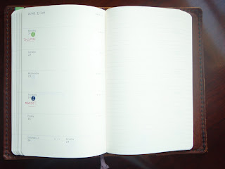
Just because I'm in love with my Quo Vadis Minister doesn't mean the Moleskine 18 month weekly notebook is a bad planner. Actually, it's an excellent planner.
Here is a photo of the inside (which you can click on to get a better view), just in case you haven't seen one of these yet. The Moleskine layout is very clean and simple, yet there are features that show the high attention to detail. For example, I'm not sure you can see this from my slightly washed-out photo (you can in the enlarged view when you click on it), but the lines that mark the borders of the daily spaces continue straight across the page and merge seamlessly with the lines on the opposite notes page. This not only makes the page spread look great, it's also very useful if you need to continue your schedule or tasks straight over onto the notes page. Lines out of alignment would have looked jarring. It's little things like this that make a Moleskine especially pleasant to use and look at.
The top of the weekly schedule page has a large space for writing whatever you want. Personally I resented this space because I would have rather had more space for the weekends (which have very tiny spaces for Saturday and Sunday), but I know people like this space for making notes or highlighting the week's priorities or goals.
The unobtrusive lines and minimalist typeface contribute to the streamlined appearance. Holidays are not written on the page, but initials of the country having a holiday are noted on the day's space, in the corner where it won't interfere with your writing.
The mostly-blank pages allow for customization and creativity. There is nothing constraining in any way, and even the lines can be written over easily. This is a great planner for people who need open space for their days without time constraints or lines. But people (such as myself) who crave more structure can do that too. As you can see I wrote in the beginning and end dates of the week next to the month, to make it easier to find the correct date while flipping through my book. Also you can see the Filofax stickers I used to indicate important dates. (More on these stickers in a later post!)
The layout of the week on the left page and a lined page on the right works well for a lot of people in various situations. I think this would have been great while I was in school, when I didn't have many scheduled events on any particular day but did have lots of to-dos and assignments to keep track of.
This planner worked fairly well for me when I didn't have too much that I needed to write in any particular day. But when my days were very busy, I found there was just not enough room to write (especially on those tiny weekend days!). I did enjoy having an entire blank page each week, and could use it differently every week if I wanted to. Some weeks the page was full of tasks. Sometimes I had phone numbers, notes, directions, party guest lists, websites and books to check out, or whatever other random thing I needed to write down. It was nice to have a place to capture all of those jottings that might otherwise get lost. I think this is the biggest appeal of the weekly notebook format.
The usual Moleskine features apply: nice paper, sturdy binding, hard cover, elastic strap, back pocket. The corners are rounded and the book is very pleasant to use and hold. The black hard cover planners come with a removable address book, which I find very useful. The front pages include tons of international information (which I appreciate and refer to often). There is a very lame map of international time zones that is not detailed enough to be very helpful. The 18 month planner also has pages to write your class schedules for each semester. I have transformed these into charts to track my financial totals since I don't have a set weekly schedule.
Besides the main weekly notebook there are other calendar formats too: monthly views of the second half of 2009, all of 2010 and 2011 with the days as numbers. Also there are calendars with the months as columns with a line to write each day, 2 months per page, for July-December 2009, all of 2010, AND ALL of 2011. I do a lot of long-range planning so I REALLY appreciated this. Bravo Mole!!
My Mole is the large size. In the past I have used the pocket size, and it is tiny. It really would fit into a pocket, and would be a good choice for a satellite book to a larger desk planner, or for someone who doesn't need much writing space. I chose the 18 month planner because I wanted the weekly notebook with a black hard cover. The 12 month weekly notebook only has a hard cover in red (which I loooooathe. I hate that screaming red! But I must be in the minority because I know it's very popular.), or soft cover in black. So to get the black hard cover I had to go for the 18 month book. Which, interestingly, costs just about the same as the red hard cover 12 month book.
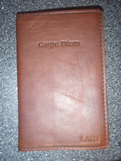
The 18 month book is great obviously for those on an academic schedule, or anybody who needs to start their planner anytime between the beginning of July and end of December.
I had this custom leather cover made for my Mole by Renaissance Art, and they did a great job. They tweaked it for the thickness of the 18 month book, and did the customization exactly how I wanted. The 18 month weekly is the same thickness as the Moleskine sketch book, so I will continue to use this cover on Mole sketchbooks, because the cover is too awesome not to use!
So there you have it, just in case you thought I was dissing the Mole. There's a lot to love about the Moleskine weekly notebook. If you want a planner without constraints and need the flexibility of a notes page every week, then this one is definitely worth checking out!
Monday, December 14, 2009
Past vs. Future
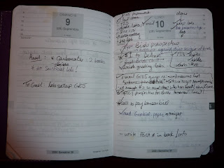
As I've been going through my old planners (see my Ghost of Planners Past series) I've been reliving what my life was like during those years. It's really interesting to see what I was doing at the time, and little details I'd forgotten. For many years I have kept journals, but my old planners give me a much better picture of what my day to day life was like at the time. My journal is good for recording what I was thinking/ feeling, but my planners show me what I was actually DOING.
My favorite past planners to read are my day-per-page ones. An entire page for every day gives me lots of space (and therefore incentive to fill it) to write what I'm doing/ have done that day, which makes an excellent record. I tend to jot down things on the page that I wouldn't have with a smaller space, and it's these little details that tell a lot about what was going on in my life at the time.
The photo shown (which you can click on to enlarge) is a page spread from my Textagenda (that I bought on a trip to Paris which is why it's in French) that I used in grad school. I studied the origin of birds for my Master's degree, and was an assistant instructor. Here you can get an idea of what a typical Monday was like for me: the Priority of the day was to complete a section of my paper. My schedule at the top of the page was pretty full. In the notes section you'll see I had to email some guys about materials to set up the undergraduate lab I was teaching that week. You can also see that materials were in short supply so I had to borrow or share things like books and overhead transparencies. I needed to finish grading the previous week's labs to hand back to students that week. And, oh yeah, I had to get my homework done too. I was pretty busy!
You can also see where my money was going: a dollar to DeAnn, the secretary (for a Geology department chip-in for someone's birthday), $10 cash to buy materials at TIS (our university bookstore, which happens to be where my sister bought her Textagenda a few years before), and of course the big one, to pay my university bursar bill for the semester.
Just this one page tells a lot about what was happening in my life at that time. And my planner was a great reference too. Later when the Bursar's office called to give me a hard time about not paying my bill, I was able to look up that I DID make the payment, over the phone, on Lundi 10 Septembre. See the check mark? That means it's done!
Speaking of using a planner to record daily details, the Quo Vadis blog (which is excellent by the way and you should read it) recently had a guest post by DianeB of Pocket Blonde where she talks about how she uses her Textagenda to record what she did at work each day. This makes her monthly reviews easier to write and gives a more complete view of how she spent her time that month. When she kept a record of the little details she otherwise would have forgotten, she discovered she was being productive in ways she hadn't realized before.
Using the same book to record not only appointments and tasks but also ideas is very interesting to me. Jeff Abbott has said that he uses his Journal 21 as a combination planner/ journal. I love this idea because it seems like it would paint a more complete picture of your life at that time: what you were doing, ideas you were contemplating, what was going on around you. I may try this in 2010.
Ultimately I use my planner not only to plan, but also to create a record of when I did things such as when I sent that check, made that phone call, or whatever else because I tend to forget these kinds of details. My new Minister (that I luv-luv-luuuuuv) has large daily columns in the weekly view that give me space to plan as well as record. It makes an excellent record for me to look back at what I did and when I did it.
Format becomes an issue when using a planner not only to plan but also to record. The more space you have for each day, the more details you can write down. But in order to have so much daily space, sometimes you have to sacrifice other features. Although day-per-page books are great for recording lots of details, they can be difficult to use to plan ahead for upcoming events. A planner with a weekly view needs to have large day spaces in order to do much recording. But larger day spaces can mean a larger book, and of course the larger the book the harder it is to carry around everywhere in order to have it handy for writing down those details.
Do you use your planner purely for planning? Or do you use it as a combination of planning and also record-keeping to refer to later? Do you feel like you have to sacrifice a longer-range calendar view, or a portable size book, in order to have enough daily space to record all of your details?
Friday, December 11, 2009
Friday Extra: Online Deals
Here are some excellent deals I keep getting emails about:
http://www.moleskineus.com/
USA
http://www.moleskineus.com/
Friday Poll: What's your format?
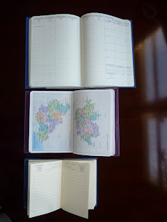
Hey everybody, now's your chance to tell us all what diary/planner format you use! I feel confident that I can speak for all Plannerisms readers that we REALLY want to hear how everyone uses their planners.
So here's what I want to know:
1) What diary format(s) have you been using for 2009? Day per page? Week + notes? Days as columns? Or something else entirely?
2) Do you use a bound book (like Moleskine or Quo Vadis), or a binder with removable pages (like Filofax)?
3) And perhaps most importantly, will you be using the same system for 2010? Or will you be trying something new?
Come on, spill it!
Wednesday, December 9, 2009
Ecosystem Planners and Notebooks
Here is a brand I've only recently discovered: Ecosystem, a brand of 100% post-consumer recycled paper planners and notebooks. Please understand that I do live under a rock, and I don't have access to many brands that are commonplace in the US or UK, so if everybody already knows about these except me then please forgive me. But they look really interesting!
The 4 categories are cleverly designated: Author (lined pages, for...writing), Artist (blank pages for...art), Architect (quad ruled pages for...architect-ing) and Advisor (planners!!!).
They look very Moleskine-esque with their elastic strap and ribbon page marker. But unlike Moleskine they have a nice selection of cover colors. I especially like the Watermelon (pink) and Lagoon (blue), but of course I had to jump onto their website to send in my request for purple. I can't help it, I like all things purple and hey, they asked for color suggestions!
Perhaps most intriguing is that they sell separate inserts in a variety of formats to tuck into the back pocket of the book: to-do lists, monthly calendar (!), addresses, lined, blank and more. In my opinion this increases the functionality of a book exponentially. For people who have tons of lists but few appointments, you could tuck a monthly calendar into the back pocket of a lined book and boom, there's your planner. When the notebook fills up before the end of the year, no problem: you just move the monthly insert to a new notebook and you're set. Or for people who need to schedule appointments and write lists or notes, tuck a notes insert into the back of your weekly planner, and when the insert fills up you can easily replace it. I think this is a great system.
Ecosystem seems to have done everything right: a great selection of sizes, cover colors, and formats. 100% post-consumer recycled paper. Made in the USA. But I'm wondering what the actual products are like. Is the paper nice to write on? Does liquid ink bleed through? Will the book hold up to a year of use and being thrown into a bag?
If you have used an Ecosystem notebook or planner, please leave a comment! I'm veeeery intrigued. Hmmm...
Labels:
ecosystem,
monthly,
recycled,
week + notes,
weekly
Monday, December 7, 2009
Ghost of Planners Past #3: Русский стандарт*
 * Russian Standard
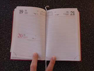
Here is a day per page planner I bought while I was living in Moscow. That year I was using a different day per page planner that I really loved, so this one didn't get much real use. What I did use it for, which it was great for, was communication. As you can see from the photo (which you can click on to make larger), the days and months are written in English and Russian. This helped me learn my days and months, and was extremely useful to communicate with my language instructor and anyone else exactly what day we were to meet. Both of our languages were there on the page, and I wrote the appointment directly onto the page at the appropriate time, so there was no confusion whatsoever of when we were scheduled to meet.
It seemed like the majority of people I knew in Russia used a day per page planner, and they used it for everything: not only planning but also meeting notes, random jottings, sketches, etc. I've been fascinated with how people use their day per page books ever since my sister's Textagenda.
Another feature of this planner that I really like are the types of information at the beginn
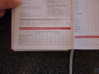 ing of the book. I like to buy a planner in the country I'm living in at the time, for the country information. This planner is full of useful info that I wouldn't otherwise know such as calling codes for all of Russia, car license plate codes, lists of Russian holidays. And perhaps most interesting, there is a chart of blood alcohol decay time. Russia has a zero-tolerance drunk driving policy. So this little chart tells you how long you have to wait until you are legal to drive. Brilliant!
Saturday, December 5, 2009
Idea: weekly lists page in day-per-page planner
I was looking at emil2099's beautiful photo on Flickr of his weekly tasks lists written in his day-per-page Moleskine planner. It made me think of how I usually have a lot of tasks that don't necessarily need to be done on a particular day, but sometime during the week. I think for someone using a daily book, emil2099's idea of writing his weekly lists on Sunday or Monday is a great idea so as to not have to re-write the same tasks day to day. But, of course that takes up valuable space on the daily page.
So I had the idea of a day per page planner with a page before Monday every week for task lists. The page could look something like the Minister's dashboard of task boxes. Or the page could even be blank, or just lined. That would give an entire page to write that week's goals, must-do items, or non-urgent tasks (urgent ones on the day pages).
This would result in a nice page layout too: Notes page and Monday together on one spread, Tuesday and Wednesday together on a spread, Thursday and Friday, then the weekend spread with Saturday and Sunday together. This would mean that each day of the week is always on the same side of the page consistently throughout the book. In planners that are truly one day per page, the days of the week alternate sides each week. Some planners get around this by having Saturday and Sunday together on one page.
Has anyone ever seen or heard of a day per page planner with a notes page before each Monday? I would be really interested in a planner like this.
Ghost of Planners Past #2: The Supermodel
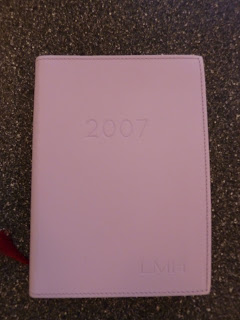
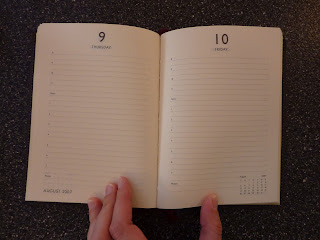
Here is a Cavallini day-per-page planner I used for awhile in 2007 that was an epic fail. The biggest problem with this planner is that it wouldn't stay open. I mean, it was beyond not lying open by itself. When I wrote in it I had to pry it open and press it down open with my left hand while writing. So it remained closed most of the time, and as my sister says, "a closed planner is a dead planner." Without my day's schedule staring me in the face all the time, I consistently forgot appointments and even what day of the week it was. In addition to its perpetually closed cover, the day per page format (with no monthly calendars in the book) didn't allow me to plan ahead at all.
Another issue I had with it was its sheer beauty. Or really, my worrying about messing up said beauty. My life is messy, and a pristine smooth leather cover wouldn't stay that way for long without some serious protection. Whenever I had to take the planner anywhere in my bag, I sealed it in a zip-lock bag to keep it clean. Whenever I had to pry it open to write anything into it, I had to make sure my hands were clean and dry. This quickly became a complete pain in the ass.
I realized it was useless as a planner so for awhile I used it as a journal. But prying it open to write and cramming my handwriting into the tiny lines was so frustrating that I finally stopped using it altogether. It's a shame too because it's a beautiful book. The leather is soft and nice to touch, I love the personalization with my initials imprinted on the cover, and overall it's a very classy-looking planner. My sister summed it up perfectly: "It's like a supermodel: beautiful, high-maintenance, and ultimately useless."
Friday, December 4, 2009
Meet Highlander

Many thanks again to Karen at Exaclair for sending me an Equology cover for my Minister in Rose. My Equology Minister came with a black cover, which is very professional looking, but I really wanted the nice bright color of the Rose cover. I have recently turned anti-black for my planner and notebook covers in favor of color whenever possible. The Rose Equology cover is a nice cheery color. I like it!
So the pink cover doesn't exactly look like something that would be called "Highlander," but in my epic battle between planners, my Mole is Neo so my Minister, by default, is Highlander.
And I am very happy to announce that Highlander, aka Equology Minister is...
***TRUMPETS SOUNDING AND ANGELS SINGING***
THE ONE!!!!!
After less than a week of use, the Minister is far and away the clear winner over the Moleskine weekly notebook. So much for Calling the Dog--I haven't even opened the Mole since I started the Minister.
The Minister is so much more structured and organized than the Mole, which apparently I need in a big way. This first week of using the Minister I have been systematically working through the enormous pile of things I had procrastinated endlessly while I was using the Mole. The Minister is so effective because the categorized task boxes let me see what I need to do, and the timed daily columns let me see when I have time to do it. Genius.
Another reason why the Minister works so well for me is because I remember things visually. I remember by visualizing the page that I have something written at 5pm even if I don't remember what it is. I remember I have something written in the "Phone" box even if I don't remember who I'm supposed to call. So I remember to check my planner for details, and I stay on track.
I don't know if the Minister is my Perfect Planner, but it seems to be the closest thing in existence. The weekly layout. The tasks boxes. The international information. The maps! It's packed with features that I use. I love it!
Welcome, Highlander!
Thursday, December 3, 2009
Ghost of Planners Past #1: Desperation
I'm going to do what every big sister does: blame my little sister. It's her fault. It IS. Seriously.
What's her fault is my obsession with Quo Vadis planners in general, and day per page planners in particular. Here's the story:
About a decade ago, my little sis was a freshman at the university where I happened to be working. That situation lasted one all-too-brief, awesome semester before she and I both moved on to different places. More on that in a minute.
That school year my sis was using a Quo Vadis Textagenda day per page academic planner. I was obsessed with it. I had never used a day-per-page planner before and was fascinated by how she used it. Whenever she had to write down directions to someplace, she wrote them directly onto the page of the date she was going there, because there was plenty of room on each day's page for notes. Whenever she had to jot down a telephone number, some random note, an assignment, whatever--onto today's page it went. No lost sticky notes or scraps of paper. I was enthralled.
The book itself was marvelous: a hard, shiny, colorful cover (that they don't make anymore). That famous Quo Vadis paper. The anno-planning calendar. It was the perfect size to hold in my hand or tuck into a bag. I wanted one.
Fast forward a year, when I had moved on to my next destination: Nepal, where I was a Peace Corps volunteer. During my 2 years there I felt deprived of American products constantly, especially notebooks and planners. I begged my mom and then-19-year-old sister to send me a Textagenda just like my sis had the year before. They searched and scoured every store they could find. I think. Or maybe they just goofed off and promised me they were looking, who knows. Meanwhile I was on the other side of the world salivating at the very thought of a cheeseburger. And a Textagenda!
Finally they found one, on sale no less, and sent it to me. But by the time they found it, and the 6 weeks it took my mail to reach me had passed, the planner was only a month away from finishing. Oh, the heartbreak!! The devastation!! Just when I had finally gotten the thing I craved so desperately, it was almost done. So, I did what all Peace Corps volunteers are best at: improvising.
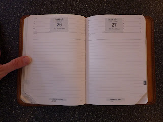
As you can see by the photos (which you can click on to get a bigger view), I went through every single page of that planner and changed the days to reflect the upcoming year's dates. Obsessive? Yes. But I had plenty of time on my hands and I really wanted to use that planner!!
Now when I look back through that Textagenda I vividly remember my days as a volunteer: Planning teacher trainings. Traveling to see other
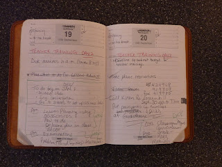 volunteers. Buying my vegetables at the bazaar. At the time it seemed very mundane, but reading it now takes me back to that unique time of my life.
And my mom and sister got an earful (actually an eyeful, from my written letters) about sending me a nearly-expired planner. For the following year they sent me a day per page Exacompta Daily Pocket planner, this time in plenty of time before the planner started!
Wednesday, December 2, 2009
BLIP (Big Letdown Italian Planner)
Today I am featuring a guest post by my sister about her Big Letdown Italian Planner. I'm sure we've all experienced similar planner heartbreak at some point, but this one seems especially tragic. Let's read and commiserate...
Long ago, in a far-away land… or, I guess it was really last summer in my office, one of my co-workers and I were discussing planners, bags, and other various life organization tools and accessories. He told me about one of his favorite companies/websites: paperhaus.com. I was interested, so we perused the website, and came across this Italian planner...
http://paperhaus.com/nava-design-settegiorni-baladek-medium-portrait-black-nero-p-4188.html
… It is called a Settegiorni. I was INSTANTLY excited, for myself, but more so for my sister. This could be The One! It’s got the weekly spread that she likes! The days as columns! The large boxes at the bottom for daily tasks and lists. “THIS IS IT!!!!” I thought to myself. I ordered it on the spot. I loved its contemporary/sexy/cool look. I bought it with the hope that I would love it and I could get one for my sister once I thoroughly tested its possibility of perfection. The size seemed ideal, the cool black flap thing to serve as a placeholder seemed creative yet simple. Oh, how in love I was with this hot Italian number. But, like I’ve heard Italians are notorious for, the Sette broke my heart.
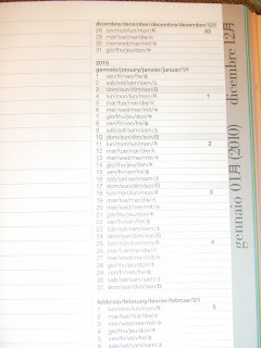
Let’s start with the fact that there are very few images online to show the details of the book. I could tell there were a lot of languages used throughout the book. I noticed that the top of Sunday had a ton of words and numbers in the right-hand corner. I figured it was some kind of monthly view list. But, I didn’t know. I scoured the Internet for images/descriptions to resolve the confusion. I even went so far as to try to translate Korean into English to learn more about it while I anticipated the Sette’s arrival… http://collection.sukima.co.jp/?itemid=930&catid=21
Even more disappointing and frustrating was the close-up image of the notorious top right corner. No matter how much I squinted; no matter how close I pressed my eyeballs to my monitor; I could not make out exactly what was going on. But, who cares? It will ship by the end of September. I can be patient!
But, it didn’t. September came and went. I finally received it in the middle of October. It was an instant disappointment. This planner has so much potential… for an Italian.
Here are the fabulous features:
Columns for days, although a large space is set aside for a “siesta” of sorts from 12:30 – 14:00. I guess lunch lasts at least an hour and a half in Italy. Also, as my sister suggested, I’d have to highlight the words that are actually written in English, since they’re surrounded by Korean, German, and of course, Italian.
The weeks are labeled (in red) on the bottom left of each weekly spread. (Week 1 through Week52).
The daily boxes below the columns are large enough for lists, if you write small enough.
There are some beautiful maps of Italy, Europe, and the World.
If you’re traveling through Europe by car, there is a convenient chart for mileage between cities.
There are also other very useful reference/information materials in the front.
There is a nice address book in the front of the book, if you don’t mind it being before your planner pages, that is.
That black flap is awesome as a place holder!
There’s some cool other cool apparatus that came separate from the book. It’s sticky, and it’s black with some plastic piece… maybe it holds the corner of the book? I don’t have a clue, really, but it looks useful… if only I could figure out its use. Ha!
I LOVE that the edge of the page is a specific color, based on what month it is. This is great for quickly finding the month… if you read Italian.
There is a 2011 2-page spread of some boxes and words that look pretty cool… if only I knew how to use them.
Shameful Features of the Sette:
WHAT is up with the 2010 holiday planning page? The 2010 fiscal calendar? And, how long did it take me to realize that one of the 2010 spreads was a list of feasts of the Saints?! I’m Catholic and all, but it took me a while to realize what an entire spread of this type of information meant:
2 sabato ss Basilio e Gregorio
3 domenica s Genoveffa
Again, being literate in Italian would’ve helped.
The 2010 planning page on the last spread leaves no space whatsoever for planning… I guess it’s just more of a reference than anything.
Bottom line: If I took the time to figure this book out and thoroughly review the pages, I’d probably think of some way to incorporate this book into my life, fall in love with it, and retain a total commitment. But, the truth is, that the language of love can only get you so far. At some point, clear communication is absolutely necessary.
For those that have made it to the end of this not-so-happy ending of my romantic novel… my Italian love affair turned heart-break… please review the images. PLEASE give me advice as to how I can save this relationship. Or, if you’re as disappointed as I am, please give me words of encouragement to just let it go, realize that it was never meant to be, and realize that it was simply a Big Letdown Italian Planner from the get-go & I was simply blinded by its beauty and sexy style.
Tuesday, December 1, 2009
More things I love about the Minister
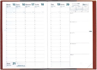
Here are some more things I love about the Minister:
1) The FAINT lines!!!! They are just guidelines, not dark or glaring in any way. They don't clutter up the page or make it look too busy, which helps my handwriting stand out on the page. (Which is the goal, isn't it, to easily see what I need to do?) I also like that there are no lines for the half hour, which makes the day columns look more open and clear. When I briefly used the Visual earlier this year, the lines on the half hour made the page look too busy for my liking. When the QV Trinote came out with darker lines, people rebelled (scroll down to the reviews). Take note, Quo Vadis: we like our lines faint, but visible.
2) The days as columns. If I don't get something done on the day it's written, I can just draw an arrow over to the next day. These arrows are also a good visual indicator of procrastination: the more arrows on my page, the more I am procrastinating. This is one of the reasons why I wish Sunday had its own column right next to Saturday, so if I don't get my weekend tasks done on Saturday I can arrow them over to Sunday.
3) Easy to find multiple calendars. This is a big one for me, because I really use all the different calendar types in my book. (See my Monthly Calendar Insert post.) In my Mole I was always thumbing through the many pages at the beginning of the book to look for the monthly calendars and annual calendars, marking them with sticky tabs, etc. It's so easy with the Minister. The 3 year calendar is located at the very back of the book. Super easy to find. And, the anno-planning calendar (which I will go on about in a moment) is at the very beginning of the weekly pages. I tear off the corner tab at the end of each week (I already took out two to be able to find this week), but I left the corners on the front pages of the book and the first page of the anno-planning calendar. So when I hold the right corner, it opens to my week. When I hold the left corner, it opens to my year overview. Easy.
4) That anno-planning calendar!! Now don't get me wrong, the Moleskine has the calendar with the months as columns too. But it has two months per page, so to see the whole year you have to turn a few pages. But the Minister has the months as columns with 6 months to a page, so the entire year is spread out in one view. Yes there is more room to write in the Mole month columns. But, I really prefer to see the whole year at once. I use this calendar format to show travel, and we travel a lot. My husband travels at least once per month for work, I travel by myself occasionally, and we all travel as a family several times per year. This calendar lets me see when we go, and where. It also helps enormously to avoid mishaps such as my husband traveling during birthdays, which has already been narrowly avoided by rescheduling a trip early next year. Love the anno!
5) The priority box at the top of each day is big enough to write my own stuff in (which I do often), but also has lots of holidays and the phases of the moon. Yes I love the phases of the moon on my calendar. And, I really need to have the holidays pre-printed on the days. I live in a country where the holidays are different from the ones we celebrate in the US, and in the past when I have used calendars without holidays pre-printed I felt disconnected from what is going on in the rest of the world. Seeing the holidays, especially for the US and UK (where I travel frequently) is especially useful for me.
6) The maps. The maps. The maps! The people I know travel a lot, and to odd places. Frequently in the course of a conversation I find myself wondering something like, "Where exactly is Djibouti?" For those of you who don't have a Minister planner handy, Djibouti is located between Somalia and Eritrea. I use the maps ALL the time.
7) The paper. For those of you who use a traditional Minister, you know the Clairefontaine paper it contains cannot be beat. The whiteness, the thickness, and the incredible smoothness is unsurpassed for writing. My Minister is of the new Equology line and uses 100% recycled paper. Even though I can tell it is recycled, I would never guess without already knowing that it's 100% recycled. It isn't as silky smooth as the non-recycled Clairefontaine paper, but it has a velvety texture that is very pleasant to use, and nice white color with only the slightest hint of gray.
8) Other things: The print colors (teal and gray) are easy to look at. The top right corner of the weekly layout: monthly calendars with current week highlighted, week number, beginning and end dates of the week (actually I would like if these dates were printed larger for easier visibility), all of these make the planner very useful. The book is a good size for portability but with a nice large page for plenty of writing space. I use the removable address book. The book is pleasant to hold and the paper is nice to touch. I've already discussed the categorized task list boxes and how they keep me organized.
Okay, I have to stop myself for now. Expect more Minister love soon. Mole who?
Minister Suggestions
Here are some suggestions for Quo Vadis/ Exaclair for ways to improve the Minister. Some are major (such as Sunday having its own column) and some are minor.
1) QV, I have mentioned this before but I'll repeat it for everyone here. Please give Sunday its own column and arrange the page like this: Widen the page by the width of one column. Put the Monday through Friday columns on the left page, Saturday and Sunday columns on the right page, keep the tasks lists dashboard the exact same size it is now. Then in the space below the columns where Sunday used to be you can extend the times down to 10 pm, which several reviewers on the QV website have requested. And viola, Perfect Planner!
Maybe instead of modifying the Minister, the Executive could be converted to the format described above with 7 days as columns. At 6 1/4 by 6 1/4 inches, its square shape is proportionally wider than the shape of the Minister and so it would be able to accommodate a 7th column more easily. The smaller size is very portable which is an absolute requirement for a planner that will go from work to home to weekend activities. If the Executive were converted to 7 days as columns, QV wouldn't have to create a whole new book, they could keep everything else about the Executive just as it is (size, number of pages, cover size etc.) and just change the printed format of the weekly pages.
To be completely honest, a year ago I seriously considered buying a Minister to use for this year, but I didn't because I thought the Sundays would be just too annoying. When I got the opportunity to review one for free I thought, why not? Now that I am using it, I realize that the Minister is so great that the Sundays are not a deal breaker. But yes, I would prefer all 7 days across the page as columns. I also considered the Exacompta Horizon 7 because it DOES have all 7 days as columns across the page, as well as monthly and annual calendars, and space on the weekly spread for lists. But it is 8 1/4 x 10 1/2, too big for me to carry everywhere. So what do you say, Quo Vadis? Executive with 7 days as columns?
I'll shut up about it now!!
2) A monthly calendar insert sized specifically to fit into the cover of the Minister. I have ordered the Visoplan for this purpose. But it would be nice if there were a monthly insert kind of like the removable address book, that is sized to fit in the Minister cover and is slim enough not to interfere with closing the book. Similarly, it would be nice if there were a notes insert that could be purchased separately to use instead of the removable address book for people who prefer that, and could be replaced when it gets filled up.
3) The international information at the front of the book needs a F to C temperature conversion line, from -30 C to 40 C in 5 degree increments with F equivalents. And, it would be really nice if the Chart of International Holidays included the Russian Federation.
So, #1 is the biggest deal, #2 would be really nice, #3 is gravy. And right now I can't even come up with any other suggestions for improvement! I am really enjoying using this planner.
Subscribe to:
Posts (Atom)